The Tate Modern “A Chronicle of Interventions” Spring 2014
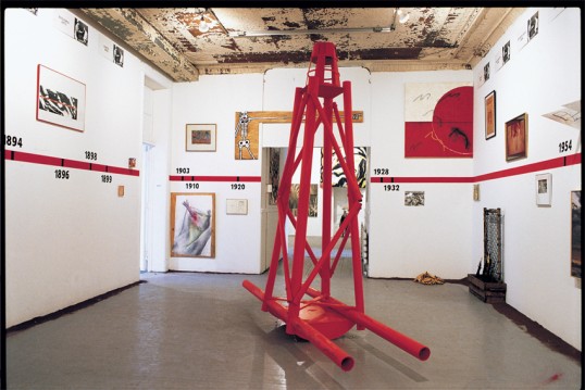
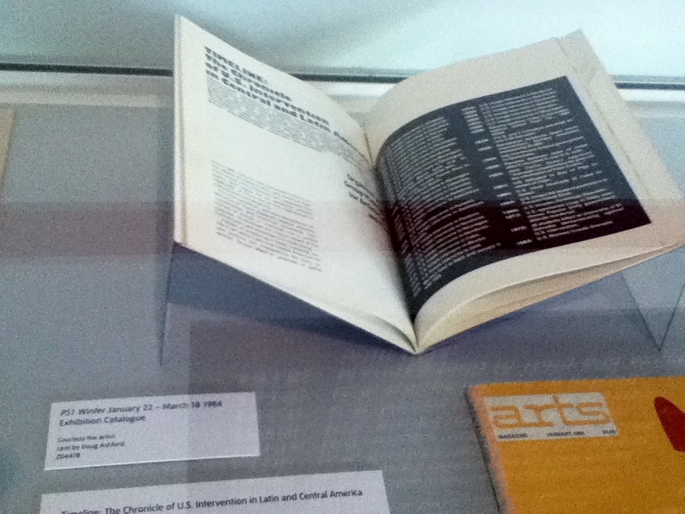
Group Material, Timeline: A Chronicle of US Intervention in Central and Latin America 1984 installation photograph by Dorothy Zeidman
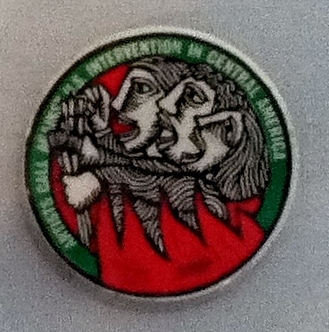
“If we can simply witness the destruction of another culture, we are sacrificing our own culture. Anyone who has ever protested repression anywhere should consider the responsibility to defend the culture and the rights of the Central American People.” “Artists Call Against US Intervention in Central America” January 1983.
While in London at the Tate Modern, tucked into a small “project” gallery at the entrance that could easily be overlooked, was an exhibition with the title “A Chronicle of Interventions.” The exhibition was a collaboration with the TEOR/éTica space in Costa Rica.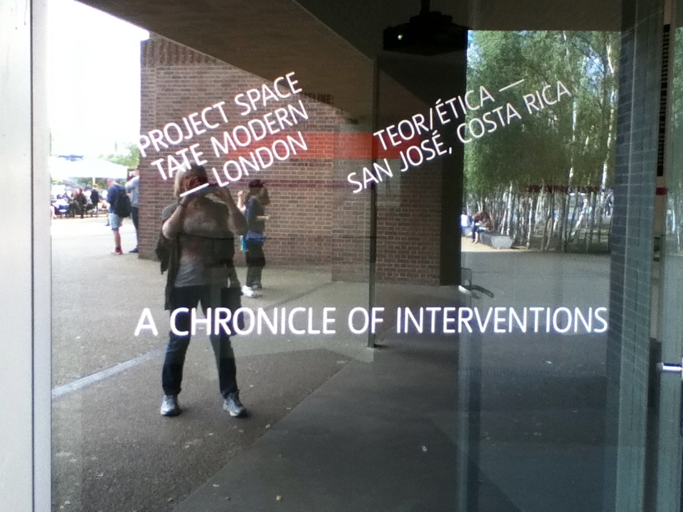
In the first gallery, Doug Ashford and Julie Ault, early members of Group Material, curated a partial documentation of the 1984 Timeline: A Chronicle of US Intervention in Central and Latin America 1984. It was first shown at PS 1 recently “converted” (minimally) from a large public school. The installation at the Tate Modern included some of the documents that appeared as part of the installation of the original timeline and a slideshow of the installation.
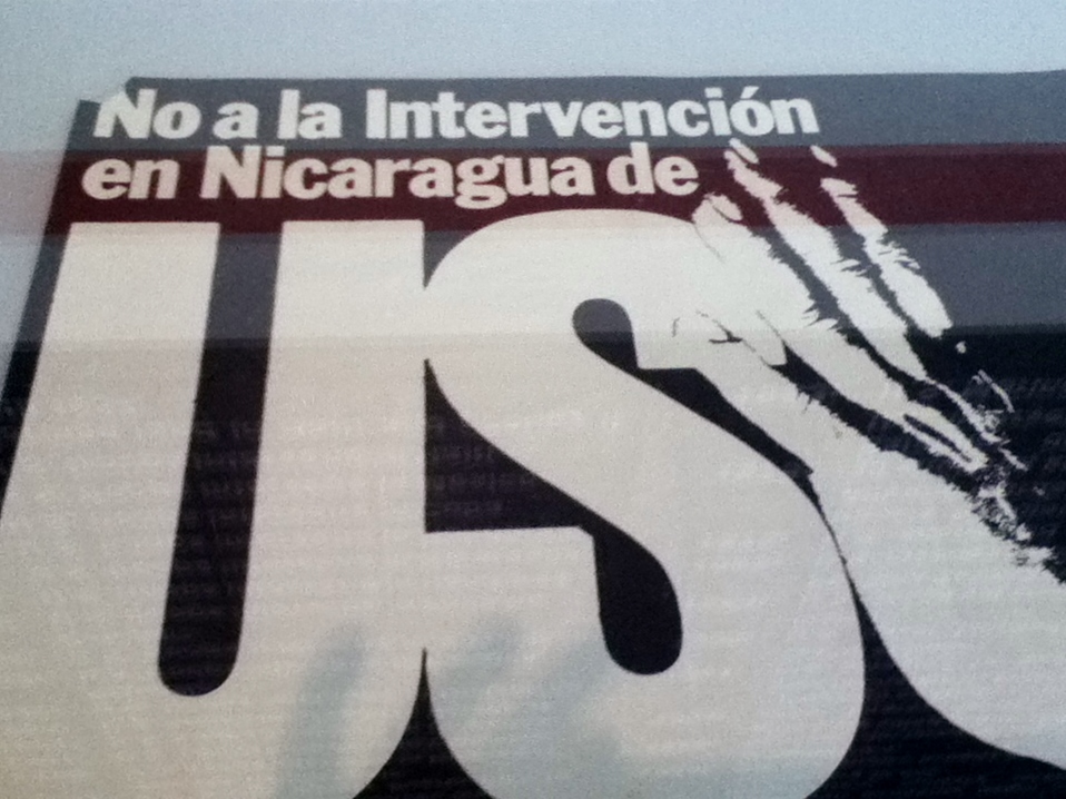
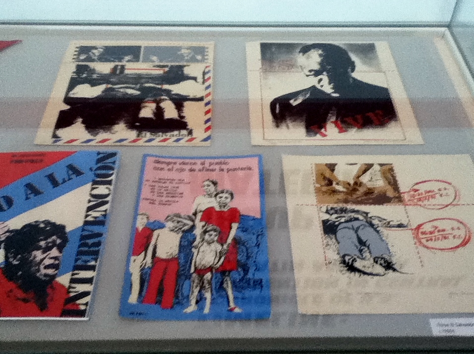
The posters, flyers, flags, articles, paintings, buttons, and artists’ prints had been submitted in response to the “Artists Call Against US Intervention in Central America” issued in January 1983. Installed at the Tate, they lost the aesthetically sophisticated arrangement and immediacy of the original installation. We looked down on them in a box, rather than seeing them in our space.
In the installation views of the original timeline that survive, we see a stunning partnership of numerous art works and ephemera arranged above and below a red line with its black dates (the colors of the avant garde post revolutionary Soviet Art).
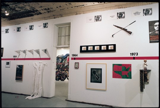
At the center of the original Timeline installation was a dramatic red construction, an artifact from a demonstration in DC: a maritime navigation buoy. As described by Claire Grace in an excellent analysis of the timeline in After All Journal, it was a “bright red sculpture that had been brandished a few weeks before the exhibition opened at a public protest in the nation’s capital. Created by Bill Allen, Ann Messner and Barbara Westermann, the sculpture takes the form of a giant maritime navigation buoy. At the demonstration, its bell rang a repeated toll of warning, marking time not metronomically but according to the jostling movements of protestors holding it aloft by the beams at its base.”
At the Tate exhibition, in spite of the museumification of the art works, the intense engagement of the artists comes across clearly. The cross media collaborations of visual artists, critics, writers, musicians, philosophers, poets, street artists compelled us to think about the power of art when creative minds address pressing social issues. Where is that collaboration today? The Occupy movement is an example. Climate Change activists are another. But today we still have a lot of fragmentation of activism, based, unfortunately along racial lines.
In the second part of the exhibition at the Tate, curated by Inti Guerrero and Shoair Mavlian from the organization TEOR/éTicabased in San Jose, Costa Rica, are seven artists using various media. The curators contrast their inclusion of artists “from the region itself” in comparison to the Timeline, which included Latin American artists in exile.
But there are other more obvious distinctions. The artists work as individuals from a theoretical distance, with modernist tropes. We need a lot of explanation in order to understand what a certain photograph or video signifies.
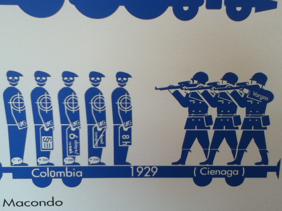
The only exception to that is Andreas Siekmann, whose charts in blue, with iconic and recognizable images, and hard hitting information, clearly tells us about exploitation. (He is German, not “from the region”).
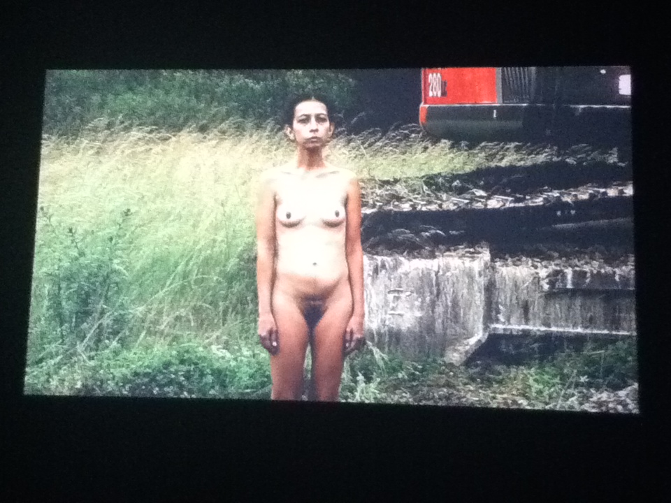
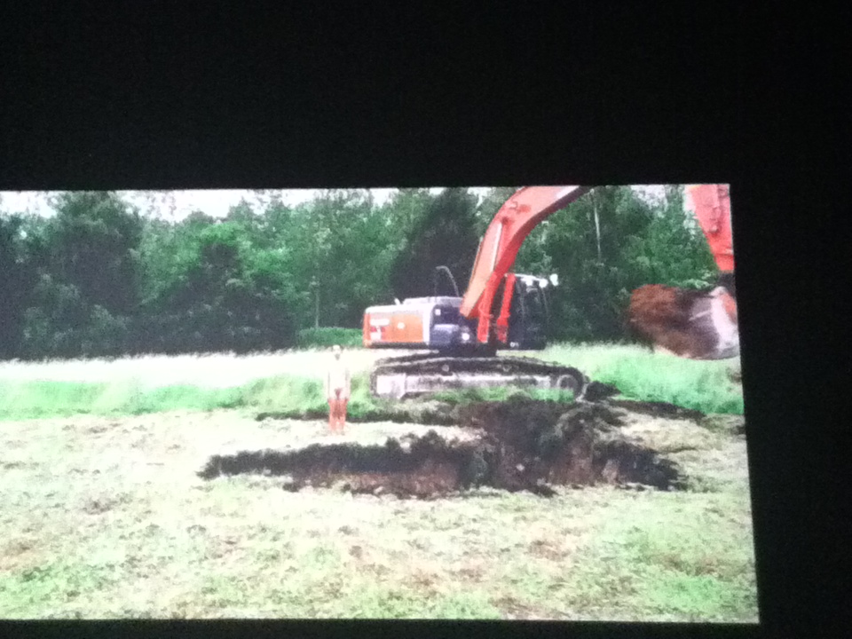
The other artist whose work is straightforward is Regina Galindo, the well known Guatemalan artist who has been protesting through performance and poetry the nightmare of violence in her country. But even her work needed an explanation. The artist stood in the field that was slowly excavated around her. We could interpret it in many ways, until told that it referred to mass graves.
Other artists were esoteric: Michael Stevenson ( from New Zealand) had a lengthy narrative “Introduction to the Theory of Probability” that connected the Shah of Iran in exile in Panama, the presence of Patty Hearst on the same island, and the theory of probability represented through anonymous hands playing solitaire. (The connection was that the Shah’s bodyguard became a mathematician). Oscar Figueroa’s performance piece laid out a 3,275’ line of blue plastic to demarcate the segregation of communities of workers for United Fruit Company (blue plastic was used to protect bananas from pesticides, so the analogy of protecting local elites from imported dark skinned workers). 
A piece of blue plastic also hung on the wall of the gallery, a post minimalist object. I wanted more!
The contemporary body builder in the film by Humberto Vélez’s film The Last Builder makes a connection between a contemporary body builder and the African bodies that built the Panama Canal. Oomph. Not particularly provocative. José Castrellón explores what is referred to as “cultural hybridity,” in a parallel of the appearance of indigenous Kuna Tribe members and punk metal bands (I didn’t get this, but maybe with music I would). Finally, there was Naufus Ramirez-Figueroa’s dance of architectural styles, three dancers wearing a style as a costume and gradually shedding it. Pretty hokey.
The overall theme is colonialism, but with the exception of Galindo and Siekmann (his project is ongoing) , there was no reference to what is actually happening on the ground today. It was all theoretical and abstruse.
The huge contrast to the heartfelt work of the 1980s artists who joined the Artists Call was obvious. That is the main distinction between Group Material and contemporary artists selected for the exhibition.
There are plenty of artists in Central America addressing current violence and atrocities. The curators from Costa Rica (itself an exception to the politics of the rest of the region) simply chose to find artists who were exploring the present through a veil of theory and modernism.
I honor Group Material’s remarkable activism in response to the violence in Central America in 1984 and hope it will inspire artists today when that violence is still so obvious.
“If we can simply witness the destruction of another culture, we are sacrificing our own culture. Anyone who has ever protested repression anywhere should consider the responsibility to defend the culture and the rights of the Central American People.” “Artists Call Against US Intervention in Central America” January 1983.
This entry was posted on August 30, 2014 and is filed under Art and Politics Now, art criticism, Art in War, Uncategorized.
Syria Speaks: Art and Culture from the Frontline
“If we can simply witness the destruction of another culture we are sacrificing our own culture.” 1984 Group Material Call to Artists.
In the defense of humanity in the midst of bestiality, of creativity in the midst of destruction, of non-violence in the midst of violence, the example of the creative voices of Syria is inspiring.
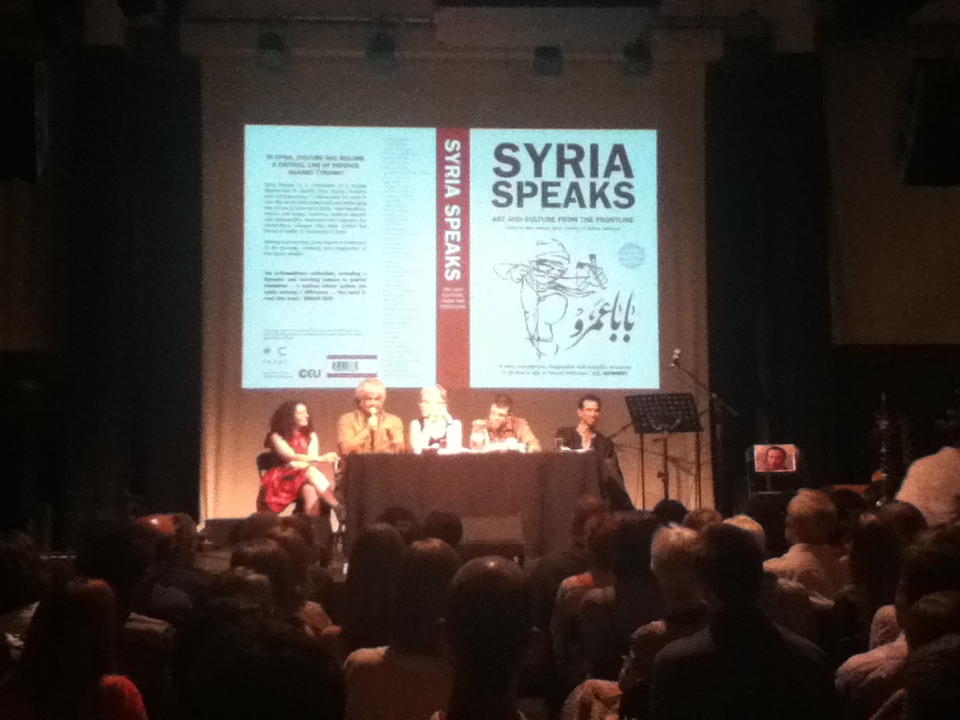
In London in early June, I had the good fortune of hearing several Syrian artists discuss the explosion of free expression in all media since the uprising against the oppressive government of Bashar al-Assad began in Syria in the spring of 2011. The program was in honor of the launch of the book of the same name published by English Pen. English Pen is an impressive activist organization that “defends the rights of writers at risk.” The book is a potent mix of personal experiences and extraordianry art, poetry, and music (of which we are given the lyrics). As I read it, I felt both heartbroken at the destruction of the country and deeply moved by the perseverance of the Syrian people.
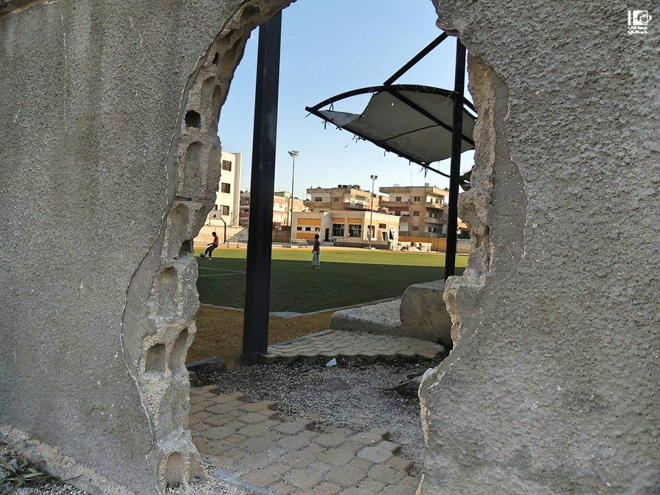
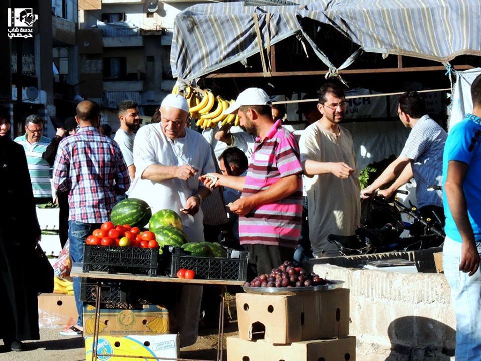
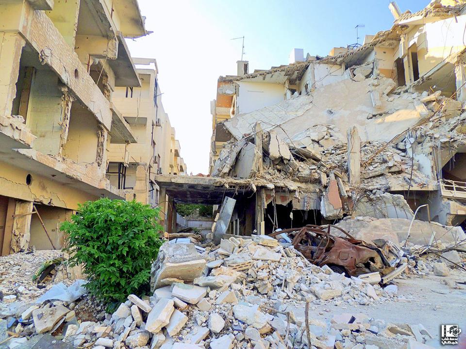
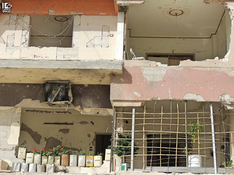
Lens Young, an anonymous collective of citizen photographers based in many cities, most clearly show us the juxtaposition of the beauty of life, the destruction of life, and the efforts for survival and return to normal life. Here is a link to their facebook page in Homs and Damascus and here are some of their deeply moving photographs that juxtapose war’s destruction and everyday life. Notice the tiny flowers on the balcony in the last photograph.
There are also explicit accounts of the destruction of a comfortable middle class life for a larger purpose: freedom of expression. I found myself identifying with these middle class writers,and wondered just how courageous I would be if my door was knocked down, and I was taken to prison and tortured for what I was doing.
The moderator of the panel in London was Malu Halasa, one of the editors of the book. Halasa and her fellow editors, Zaher Omareen and Nawara Mahfoud, have brought together an incredible collection of poetry, journalism, analysis, history, short stories, painting, pop music, graffiti, photographs, cartoons, installation, sculpture, printmaking, banners, film, stencils, and even finger puppets. Much of the work can be viewed online.
Schoolchildren began the uprising in Deraa, Syria by writing on a wall: “Al-shaab yurid isqat al-nizam” (“The people want the fall of the regime.”) one of the slogans from Tunisia and Egypt. The children were arrested and tortured, leading to the first protests and soon an uprising. In Deir al-Zour, in the stadium, a huge collective demonstration non-violently protested forty years of oppression. At the same time, the first creative expression emerged, banners by a collective Kartoneh, on black paper with symbols of the city and protest statements.
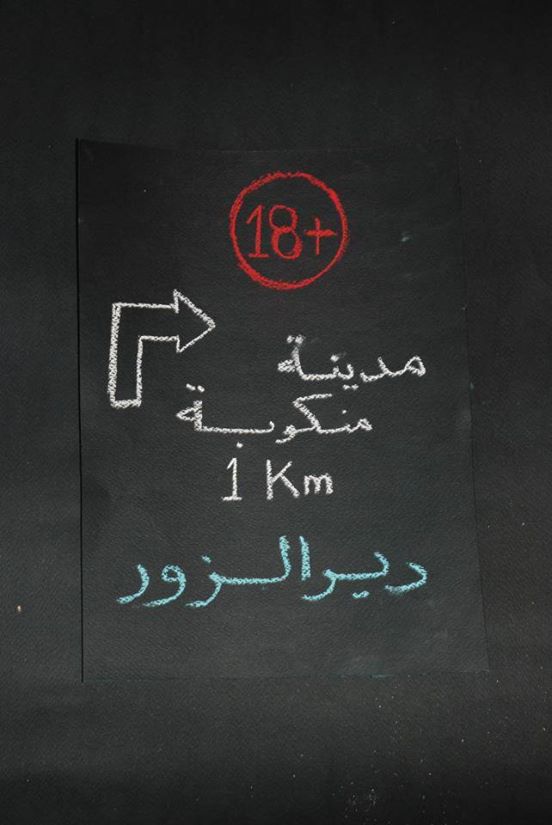
“For Mature Audiences Only: A disaster-struck city, 1 km ahead, Deir al -Zour
But the resistance and massacre of civilians in Syria did not begin in 2011. “Hama’82” with which the book begins, with both an anonymous image and a brief discussion, refers to the first massacre, by Bashar al-Assad’s father, Hafez, who attacked the city in February of that year in response to violent resistance to Baathist rule by members of the Muslim Brotherhood. The government slaughtered thousands and thousands of people. Public discussion of this massacre has been forbidden for forty years. In Homs, in the recent uprising, the government once again struck brutally, bombing, among other places, an underground journalists agency filled with citizen journalists, and killing among others, the well known Marie Colvin, a journalist with the Sunday Times.
At the panel in London, I sat next to a young woman from Homs. She was in Wales at a university, obviously to escape the nightmare. She said that her home had been entirely destroyed, and they had even taken the family photographs, a fact she repeated several times, as if she was still in shock. She had traveled all the way from Wales to attend the panel.
To understand the full context and history behind the current uprising from a cultural perspective, miriam cooke’s Dissident Syria, is essential reading. She outlines how intellectuals were in constant danger throughout Hafez’s rule, both being co-opted to support the regime, and trying to maintain a subversive dissident position. Many went to prison and died as a result. Her book examines the prison literature of the 1990s as well as film and visual art.
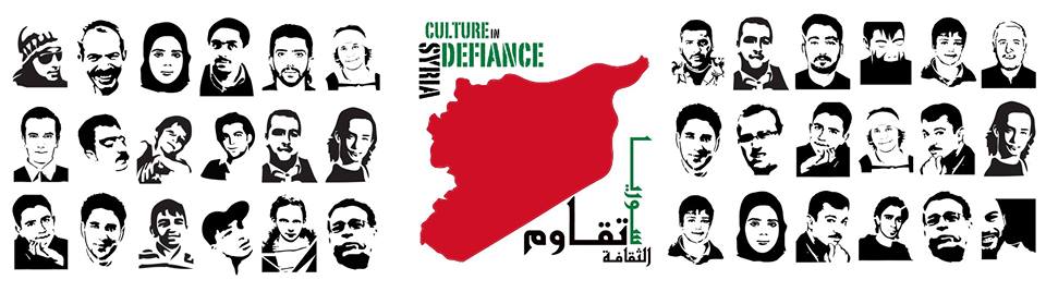
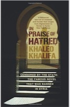
Syria Speaks, as a book, was preceded by two exhibitions organized in Europe, “Syria’s Art of Resistance,” and “Syria Culture in Defiance.” Here is the image from the second with the portraits of martyrs to the uprising and the cover of the catalog of the Art of Resistance, available as a downloadable pdf.
![]()
![]()
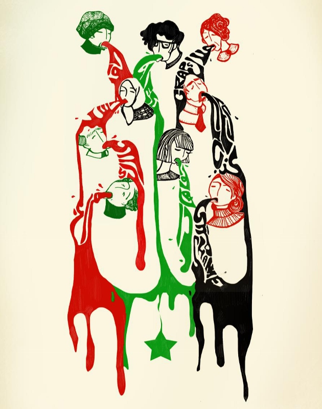
Cover image for Syrias Art of Resistance by Yasmeen Fanari Vomit
Many of the artists included in these exhibition are presented in the book. One of the best known and most radical is Yousef Abdelke, his extraordinary paintings here presented as photographs with only the artist’s head, never full face, by Nassouh Zaghlouleh. The painter was imprisoned in the summer of 2013, but was released after about a month, probably as a result of a huge international protest.
The poignent title of this chapter is “Youssef from the Inside: When you stab the ground a sparrow dies too”
But, rather than despair, there was an odd euphoria among these creative people, that they could finally speak openly -although still at great risk of imprisonment, torture, and death. One panelist is in prison and was represented by a photograph. He was Mazen Darwish, a founder of the bold Syrian Center for Media and Freedom, an organization that published banned documents from the outset of the uprising, and communicated with the international media. His letter “Letter for the Future” on receiving the Bruce Kreisky Prize for Services to Human Rights ( and smuggled out of a prison in Damascus). is included in the book, as well as a moving essay by his wife, Yara Badr, “Lifetimes Stolen” on her own imprisonment, and her childhood memory of her parents’ arrest and torture.
Sulafa Hijazi provided some excruciating images in a separate chapter in the book, such as this one. She speaks of “growing up in a militarized society in which everyone wore military uniforms to school, where we learned to fire weapons. ”
Needless to say, the presence of the internet, especially facebook and YouTube has created enormous possibilities for making sure the Syrian uprising is visible. But even with all that, it is fading from people’s attention, as ISIS, an aberrant, aggressive, retrograde group takes over the news cycle, preempts twitter hashtags,( including that of the World Cup) and invades the fragile entity that is Iraq today. The fact that ISIS came out of Syria is the only connection that is made to the uprising there, as Assad’s greater power gradually and tragically wears down the resistance. Given his history, I hate to think of what is going to happen next.
As Malu Halasa stated “Dreaming comes at a high cost.”
The journalists speaking in London at another Pen sponsored event, “Translating the Syria News, May 29 at the Free Word Centre, London” made it clear that ISIS is against everyone except their own extremist program. ISIS threatens intellectuals and creative people from one side, and Assad from the other.
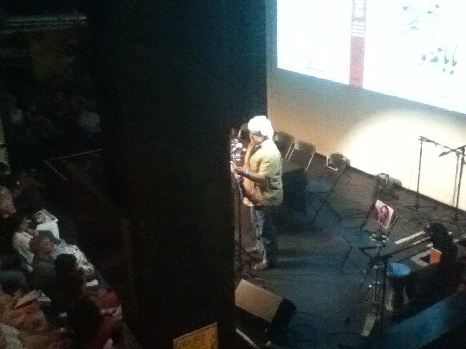
The first speaker at “Syria Speaks” for the panel was award winning writer, Khaled Khalifa ( here photographed from my perch on a balcony). He read an excerpt from his 2013 book No Knives in this City’s Kitchens. The excerpt was then translated for those of us who do not speak Arabic. Khalifa is an internationally renowned poet, filmmaker and novelist, who has chosen to remain in Damascus, despite being attacked by thugs at a funeral in 2012. He stated “This is my life. When I stop writing I am dead. “
Khaled Khalifa’s book about the 1982 “events” in Hamas through the eyes of a young woman.
The next speaker was cinematographer/illustrator Khalil Younes. I didn’t realize until I looked in Syria Speaks, that I have included his work in lectures I have given on “Art and Politics Now”. He creates homages in pen and ink drawings to cultural leaders who have died in his series Revolution 2011. Here is one example of the singer Ibrahim Qashoush the “nightingale” of the revolution. He was a fireman and a part time poet, when the uprisings began in Hama. He was deliberately murdered with his vocal chords cut out on July 4, 2011, just 3 years ago, the most explicit killing of a cultural voice in the Syrian uprising.
Portrait of the slain singer Qashoush by Khalil Younes.Qashoush inspired the masses with his music.
Other works by Younes are posted on his facebook
In the book,Syria Speaks, Younes also presented a short series of anecdotes that center around his long standing friendship with a young man who is part of the government forces. Although they are on opposite sides of the conflict, they are still friends. Younes left Syria in 1998, but has stayed in touch with him, as described in a story called “Chicken Liver.” ON the panel, Younes spoke of the complexity of loyalties in Syria as exemplified in this story. Families, friends, neighbors who have been friends for decades, are now separated by the uprising or fractured by violent death.
Finally we heard from the articulate journalist Robin Yassin-Kassab who spoke of how the narrative of the revolution has been lost in international media, mired in Orientalism. His brief comments echoed the longer, analytic discussion sponsored at the Free Word Center. The panelists spoke of the mold for the Middle East as the Arab-Israeli conflict, and the emphasis on sectarian conflict. In fact the non violent protests and citizen journalists are not necessarily identified by their religion. There are collectives of civilian photographers, many new citizen powered newspapers being published, radio broadcasts. Malu quoted from Syrian intellectual Yassim al-Haj Saleh :
“There’s an established approach in the Western media towards “the Middle East” in which journalists approach the region from a geopolitical perspective, treating it as an international stage for conflict. As a result, we don’t see the societies involved, and we don’t see ordinary people or their struggle to control their politics and their lives. Another approach looks at regional issues through the lens of religions, sects, and ethnicities, which are taken to be eternal, unchanging entities; to act as unified political blocs in all circumstances; and to be permanently fighting one another as well. There is also an inherent, fixed tendency towards Islamophobia and a false sympathy for “minorities,” who are seen as perpetual victims.
We can add to all this a view that is always confined to a narrow segment of the present, leaving no room for a historical perspective or for knowledge of the phases of history these countries have traversed, their conflicts, or their societies’ struggle for justice and liberation.
What completes this approach is a persistent preference for stability in the region, which means, in practical terms, standing with the powerful, who are capable of providing the goods of this stability.”
Wow, that really says it all. Now we have ISIS as news preempted by yet another brutal attack on Gaza by Israel as a result of three Israeli teenagers who were found dead ( I haven’t seen any speculation even on who killed them). Perhaps Israel thought their enormous brutality would be ignored as we worried about ISIS.
Syria Speaks (the link is to Saqi books the publisher, you can order it from them, I never link Amazon on this site) contains amazing art, writing, narratives, that moved me deeply. I felt my own incredible privilege and the need to immerse myself in these artists’ work, to not stand by as a culture is destroyed.
There are narratives of middle class writers, just like me, but they have stood against censorship and been put in jail and tortured. There are poems by Ali Safar, 28 short fragments of heartbreaking clarity, “A Black Cloud in a Leaden White Sky, or Death by Stabs of Sorrow”
“He didn’t die of a heart attack or cancer: he was killed by stabs of sorrow. ”
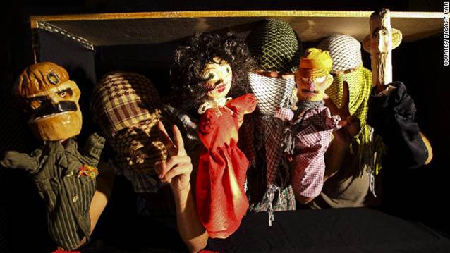
There are the finger puppets by Masasit Mati performing short satirical skits “The Syrian revolution is the only one in the world where humble finger puppets have become leading figures of opposition and dissent.”
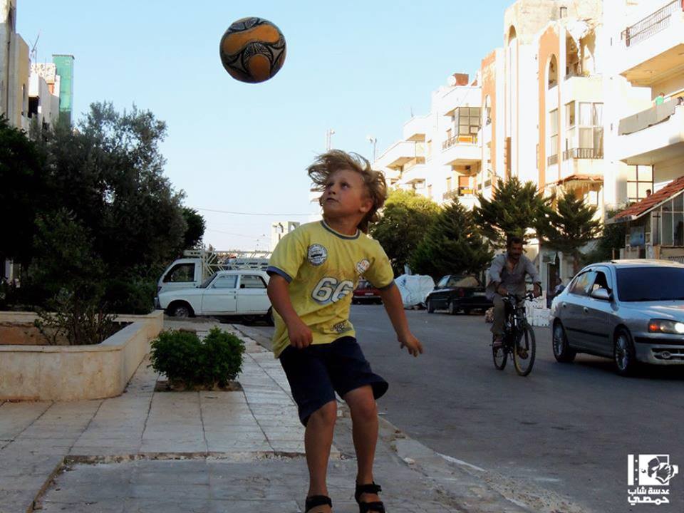
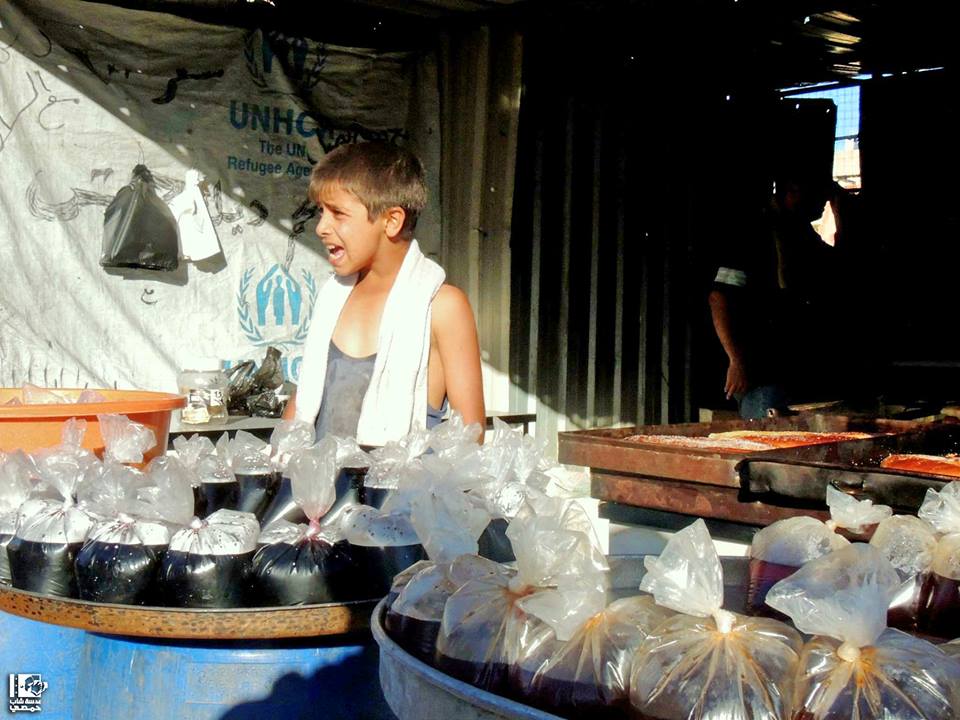
There are horrifying photographs of devastation in formerly middle class communities and photographs of beautiful children, created by the Lens Young collective in various cities (see top of post)
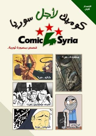
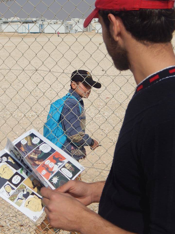
Comic4Syria (another facebook site) creates comic books inspired by Manga that tell the devastating stories of the uprising. They are being read everywhere in Syria and in refugee camps.
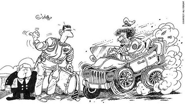
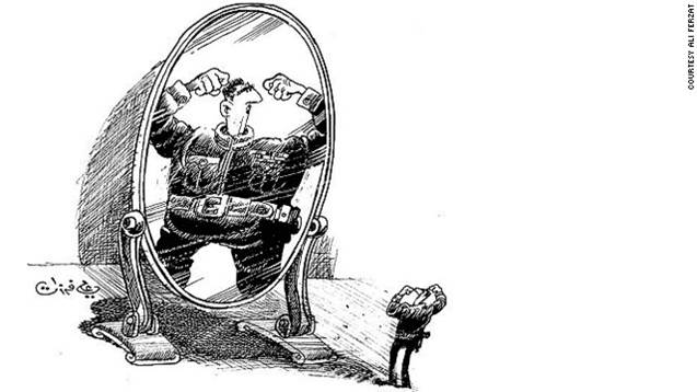
And there are the caricatures by Ali Ferzat, renowned artist who had his hands smashed by the regime. As soon as they got well he did these two sardonic images
Stencils and murals are also part of the cultural resistance, as well as graffiti in general.
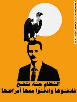
The image on the cover of the book of the boy with the sling shot originally drawn by Mohamed Tayeb, was adapted by the Syrian poster collective Alshaab alsori aref Tarekh after the Baba Amr massacre in December 2011 in solidarity with Syrian refugees.
Collectively Syria Speaks paints a picture of a people who are unbeatable, but who are in a vulnerable place in their cause now, as world attention has gone elsewhere, and Assad appears to be successful in beating back the uprising. The revolutionary non violent spirit is now replaced, as poignantly referenced in the book, by a simple need for survival in the midst of violence. At the same time, the digital journalism continues online both in the Arabic world and in the Western media. The space is opened. It will only close when the last revolutionary is dead.
As miriam cooke so eloquently states: with the kinds of images that were flooding our inboxes day after day – we couldn’t stand seeing yet another child’s mutilated body taking in its last breath – art has to come in and do something different so that we are not numb.”
On example mentioned is the work of Lebanese artist Rabih Mroue, whose “pixelated revolution” I have written about on this blog. His work is about a cell phone video which may be someone photographing his own death.
But the main message I took away from the panel discussion in London, was the sense of a surging creativity in Syria, coming from all segments of the society in many different manifestations.
One of the more intriguing essays in Syria Speaks outlined the work of a man in Dubai who actually bought the equipment being used and with a network of assistants smuggled it into the country. There were several provocative theoretical analysis in the book as well.
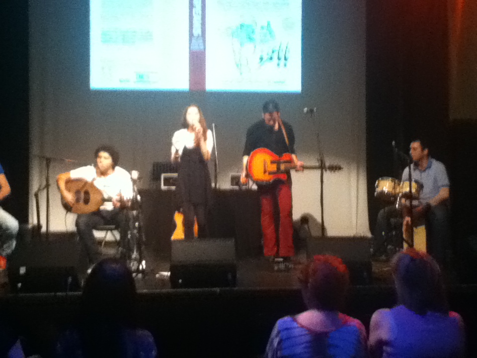
The panel was followed by a musical performance.
In the end I was left with a sense of the power of creativity in the human spirit. It is that power which I believe in against all odds, against the power of those who prefer arms, violence and death. In the end, hopefully, that creativity will prove stronger and prevail to create a new society in Syria. (more…)
This entry was posted on July 10, 2014 and is filed under Art and Activism, Art and Politics Now, art criticism, Art in War, Uncategorized.
Matika Wilbur’s Project 562 “Changing the Way we See Native America”
Matika Wilbur, Darkfeather, Bibiana and Eckos Ancheta (Tulalip Tribes), 2014. Digital silver image, 16 x 20 inches. Courtesy of the artist.
Matika Wilbur’s “Project 562” currently on view at the Tacoma Art Museum until October 5, will eventually include every “federally recognized sovereign Native American tribe.” 562 was the total number when she started, now it is 566. (I wonder if she will also include unrecognized tribes like the Duwamish, tribe of Chief Seattle). So far she has visited one third of them. She declares: “For predominant society, Indians occupy a silent and isolated, covered over, virtually extinct existence, part of the grievous though inevitable eradication of ‘manifest destiny .’ . .But Native America is utterly enduring, alive, and thriving as part of the core concept and reality of America”
Matika Wilbur is from the Pacific Northwest (Tulalip and Swinomish). Here in the Northwest we are acutely aware of the vitality of contemporary native culture, including authors, filmmakers, poets, painters, sculptors, museum curators, architects, potters, weavers, beaders, basket makers, canoe makers, singers, drummers, and political activists (we just lost the famous Billy FrankJr., who for decades has been campaigning first for native fishing rights, then for the dangers of pollution and climate change).
In Seattle we have stores selling authentic native art and totem poles in many of our parks. We just dedicated a new totem to J.T. Williams, a seventh generation wood carver, who was shot and killed by a policeman. It was carved on our waterfront by his brother and extended family. We joined the procession carrying this immensely heavy sculpture to its final installation. Just north of us is Haida Gwaii, an extraordinary island that is a sovereign Canadian nation, who with many other First Nation groups, is fighting the new plans for oil pipelines and shipping. But this is Seattle. For the East Coast and the center of the country natives are ancient history, casino owners or contentious groups asking for their land (most of the continental US is stolen Indian land, we first leased it and then just stayed).
Wilbur’s project wants to help us to rethink the idea of contemporary Native Americans and what it means, as she asked, to be an Indian today. “What does contemporary Indian look like?” How can they be “Indian enough”? According to her audio introduction to the exhibition, she is honoring“cultural resiliency, celebrating heroes and changing the way we see Native Americans.”
As I walked into the exhibition I was immediately struck by the obvious fact that these modest sized sepia prints are a direct response to Edward Curtis’s North American Indian project created in the first two decades of the 20th century. As we all know, Curtis set out to photograph “the vanishing race” at the turn of the century. He took 40,000 photographs and recorded 10,000 wax cylinders of audio, language, and music, from 80 tribes. We know that Curtis took a lot of liberties, he dressed his subjects in regalia from other tribes, for example, yet, we also know that today, this work is a treasure trove of information about much that was lost. Needless to say, the tribes did not vanish, although that was the plan of the white man.
Enter Matika Wilbur.She also accompanies her images with audio, a powerful component that makes the photographs come alive. Rather than impose herself on her subjects, she asks them how they would like to be dressed and where they want to be photographed. She invites them to discuss their present situation, their history, and their relationship to tradition. The very first photograph of Anna Mae Wescogone, age 62 of the Havasupai tribe in the Grand Canyon tells us of the past and present from her own experience: growing up with no electricity, building fires, telling stories, gathering crops, to the present life of flat screen televisions, and helicopter trips to stores. A youthful Anna Cook speaks of the shock of racism when she went from her small tribal school to high school in a nearby town. The stories are compelling.
Yet, I was disappointed. It was too close to Curtis for me (who oddly is never mentioned in the gallery or the press materials). I understand the compulsion to erase the “vanishing tribe” idea. But why were virtually every one of these photographs in rustic settings, with no sign of modern life. A few wore contemporary clothing, but they were posed in a vacuum. Instead of suggesting the realities of contemporary life for Native Americans, as for example, Sherman Alexie does in his novels and films, in which he deftly combines tradition, spirituality, and current conditions, see, for example his film Winter in the Blood. In the selection that I saw in the museum there were no run down cars, no drug and alcohol references, no activists against pipe lines, or conversely advocates for uranium exploration. Looking online, her other photography, prior to Project 562, is certainly more contemporary. The Project itself has many more dimensions not included in this selection, including environmental activism here. Wilbur wants to abolish negative stereotypes and leave a legacy for future generations. Perhaps those realities of life and activism are too negative, but resiliency is certainly overcoming those realities. But the huge native American role in our current climate change fight is to be celebrated. I hope Matika presents it more frequently. It is one of the key features of our contemporary world and personally, a major hope for our survival.
Admittedly, as I said at the outset, in the Northwest we are immersed in contemporary native culture as part of contemporary culture, not a separate entity. The rest of the country does not have that rich component of day to day life. We are also acutely aware of how recently we took the land of the tribes ( 1855) I regret that Project 562, at least in the sample I saw at the Tacoma Art Museum, seems only to present a type of frozen romance. Oddly her stated goal is to get beyond “feathers and leather”, but she is certainly presenting that frequently.
Admittedly, I have not listened to every audio ( which you can do online here)., and the contemporary video of the artist on the road was not working. That would have given a sense of her process that would have been another dimension to these isolated figures.
Last, as an outsider, my perception is that Native tribal culture is a lot about community, family, friends, extended family, looking out for each other as strangers on the road, etc, yet all of these photographs, with only a few exceptions, are single isolated people. Perhaps that is the contemporary reality that she is actually revealing. For more images go to her blog and decide for yourself.
This entry was posted on May 22, 2014 and is filed under Art and Activism, Contemporary Art, indians, Uncategorized.
Feminism and Performance: Joan Jonas and Gina Pane
Gina Pane Action Escalade non-anesthétsiéé (Action non anaestheticized Climb) (April 1971). detail
Parallel Practices: Joan Jonas & Gina Pane on view at the Henry Art Gallery until June 18 is a rare opportunity to see two groundbreaking artists working with performance in entirely different ways.
Joan Jonas was deeply inspired by the East Coast avant-garde interdisciplinary Judson Dance Theater environment of the 1960s. They are based, in part, on the ideas of John Cage with a focus on re-thinking process, movement, body, space, and gesture as an exploration in itself. Pane emerged in Europe at the peak of the Situationist movement based in a Marxist critique of capitalism. They believed that emphasis on commodity consumption instead of lived experience was leading to passivity and alienation. Situationists stated that this “spectacle” could be countered by “the construction of situations, moments of life deliberately constructed for the purpose of reawakening and pursuing authentic desires.” But those desires are political, not simply aesthetic. Frédérique Baumgartner explains in detail the ways in which Pane’s work directly corresponds to these principles in his lengthy article“Reviving the Collective Body: Gina Pane’s Escalade/non Anesthésiéé.”[i]
Currently in Seattle there is a large conversation going on among hundreds of women artists on Facebook about feminism and art. Also, recently, a “conversation” in John Boylan’s long running series focused on performance. So thinking about the role of these two artists in relation to feminism, performance, and the significance of this exhibition is timely. There is a direct connection to Seattle in the Judson Theater Group, in that John Cage taught at the Cornish College of the Arts and developed some of his formative concepts there. Not surprisingly then much of the conversation on performance at the Vermillion Cafe on Tuesday night centered on that tradition of “process” oriented performance. On the other hand, that is by no means the only performance direction happening in Seattle. One could argue that the “Occupy” movement was street theater directly affiliated with the Situationist principles. And of course, a venue like “On the Boards”, includes a wide range of performance from all over the world, some of it very political.
Both Joan Jonas and Gina Pane were included in the important 2007 exhibition WACK, Art and the Feminist Revolution [ii] (the subject of my very first blog post!) “Parallel Practices” was curated by Dean Daderko, Curator at the Contemporary Art Museum in Houston. I am going to focus here mainly on Gina Pane, as this is her first exhibition in the United States. Jonas is still working, while Pane died in 1990.
So as a starting point, let us return to those profound differences as a result of their context: Jonas is more involved with process and experimentation with media, Pane with content and presentation. I went to the show with two artists both of whom were mesmerized by Jonas’s work particularly the recent Reading Dante III (2010) a multimedia immersive environment that makes oblique reference to Dante with a drawing of woods that also appears in a video: (for clarification for those few non Dante experts, the quote is “nel mezzo del camino di nostra vita, mi ritrovai per una selva oscura che la diritto via era smarrita” “midway in the path of our life, I found myself in a dark wood, where the straight path had been lost.” ) There are also video animations of the artist (whom we don’t see) drawing spirals that may suggest the circles of hell. The installation plays on our sense of reality and fantasy through games with photography, video, and animation.
Joan Jonas, Double Lunar Dogs (performance documentation).
Presented at the Contemporary Arts Museum Houston in conjunction with the exhibition Other Realities – Installations for Performance (August 1-September 27, 1981). Photo: David Crossley
What captured my friends was the immediacy of the act of drawing represented in the videos. In another work, Double Lunar Dogs, 1984, a video using state of the art techniques of 1984, engages with science fiction in an imaginary space trip in which the participants lose their way (it co-stars Spalding Gray!), but it is mainly funny and full of visual tricks. It was accompanied by a performance by the artist and some huge drawings she did as part of a performance.
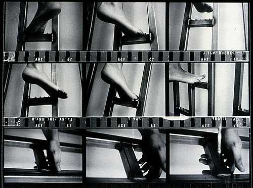
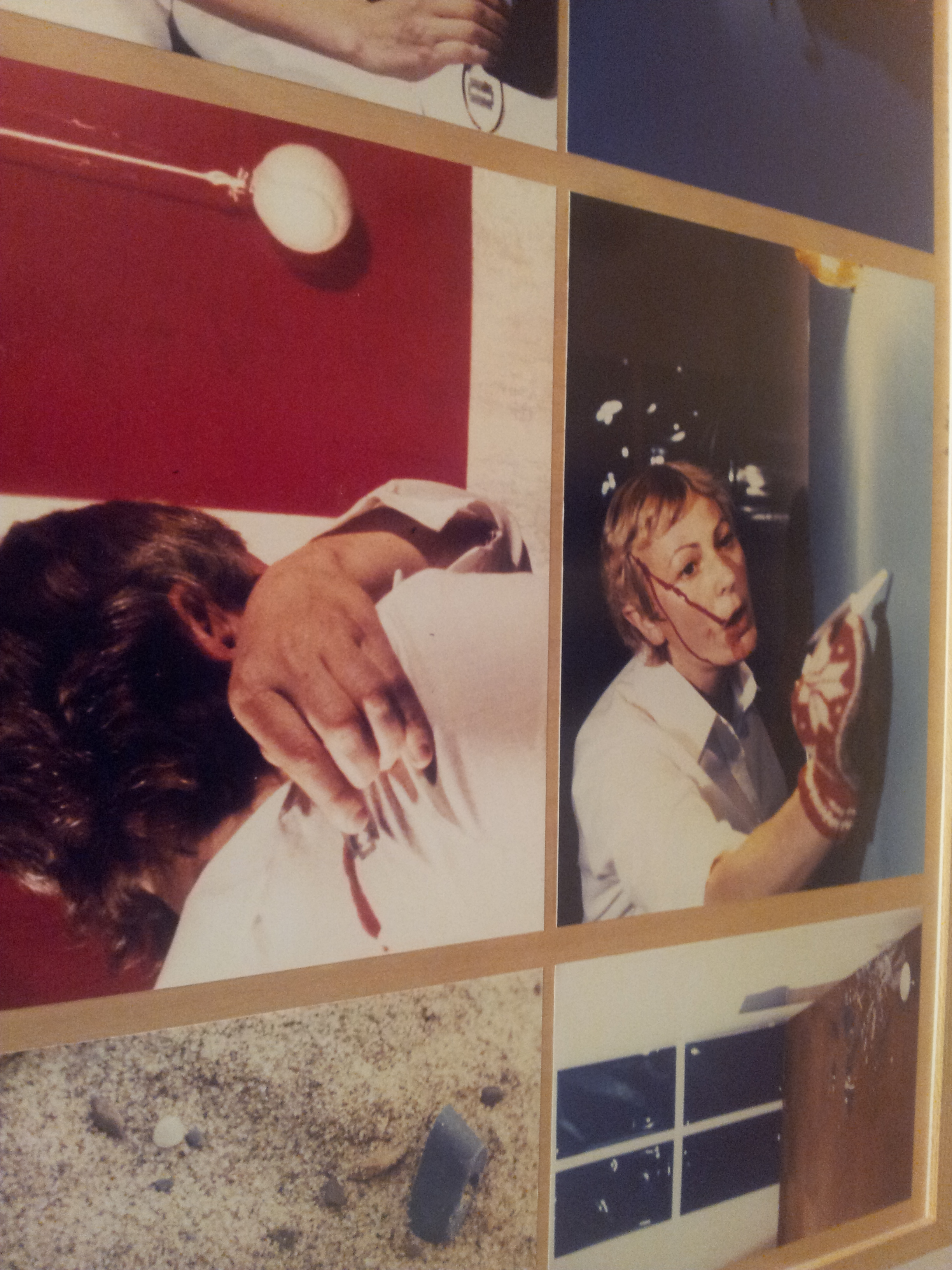
Pane, in contrast, is not at all amusing or tricky. Her work is bloody, as a result of purposeful self-mutilation. She is best known in the US for the single work Action Escalade non-anesthétsiéé (Action non anaestheticized Climb) (April 1971). It consists of a series of 69 photographs that document her increasingly excruciating climb up a specially fabricated “ladder” with steel razor blades on the widely spaced rungs. Beside it is the actual ladder which she climbed. We can see the projecting blades on the rungs which cut her feet and hands as she climbed, we feel her pain viscerally as we look at this physical artifact.
Action Escalade non-anesthésiéé (Action non anaestheticized Climb was originally accompanied by a small typewritten statement by the artist which clearly states her meaning and purpose:
Stratégie qui consiste á gravir les “échelons”/L’escalade americaine au Vietnam/Artiste – Les artiste aussi grimpent/Douleur – douleur physique á un point ou plusieurs points du corps/Douleur interne, profounde, souffrance. Douleur (morale)/ Le contraire d’une escalade anesthésiéé.
(My) translation is
“Climbing” [the word also means escalation, as in a war} –assault [can be military or verbal,] of a position by means of a ladder
The strategy consists in climbing a ladder.
The American escalation in Vietnam
The Artist – the artists also are climbing
Pain- physical pain in one or many points of the body
Pain – internal, profound, suffering. Pain (moral)
The opposite of an anesthesized climb.”
In other words, Pane has a definite political intent in this work. She is responding to the apathy of the public, by arousing them through her action to the reality of pain and injury. But, the only way that we are witness to her performance is through the photographs, arranged as a rectangle exactly corresponding in size to the ladder, and the ladder itself. She scrupulously orchestrated her actions and controlled how they were experienced. In doing that, she chose to remove the immediacy of her own pain, to make it a document of suffering, much as we experienced the war in Vietnam. I can remember at that time feeling the same way: how can people sit and watch this terrible killing on television while they eat crackers and cheese. It horrified me and radicalized me. Gina Pane felt the same way, and, in the spirit of the Situationists, she tried to break through that sense of people being numb to violence. But why did she often chose to perform without an audience and give us only her highly controlled document of it?
In contrast to other artists who have used bodily damage, most famously Chris Burden, who was very carefully shot in his right arm by a friend in a studio with a small audience in November 1971, Pane represents something which seems more radical and, to me, specifically feminist: she slashes her hands and feet with razors. She actively hurts herself. Razors appear in several of her other performances as well, most notably, Azione Sentimentale (Sentimental Action) 1973 and Action Little Journey I (1977).
Gina Pane Little Journey, 1971 detail of photo collage created by artist, from a performance at the Pompidou Center
We associate cutting ourselves with razors with suicide or attempted suicide, particularly for women for some reason. Shooting guns is more male (and Burden carefully chose where to be shot, although likely his work was also a response to the Vietnam War). The extreme of sexual violence, domestic violence, or anguished isolation, have all driven women to attempt suicide, and this form of suicide is always enacted alone (and often unsuccessfully). It is not a topic which is found in other feminist performance art at this time.
But in the years 1969 – 73, many other women, among them the profoundly important Yoko Ono, as early as 1964 with the first performance of her extraordinary “Cut Piece,”[iv], were putting their body in a vulnerable condition, often with layered political implication. But, looking at an early well known collection of feminist performance art, The Amazing Decade, Women and Performance Art 1970 – 1980[v] we see goddesses, we see mid life crisis, we see body issues. Most related, we see works about rape. But blood is not the result of self mutilation, but of menstruation.
Peggy Phelen in “The Returns of Touch: Feminist Performances 1960 – 1980” emphasizes Pane’s influence on Marina Abramovic and Orlan, both artists who took body performance to extremes of damage to themselves in later decades, but with different dynamics. Abramovic has the audience chose how to hurt her, Orlan underwent painful plastic surgery.[vi] A later artist who dealt with blood as a direct reference to political nightmares is Regina José Galindo of Guatemala. In her performance, Who Can Erase the Traces (2003) which is about the violent dictatorships in her country; she carries a bowl of blood (not her own) into which she dips her feet, leaving bloody tracks on the street.
So Pane is unusual in her willingness to take self mutilation as a subject of her work and use it as a metaphor for political violence. She really goes beyond any performance by later artists in her willingness to not only hurt herself, but knowingly deal with that self inflicted pain as a protest of violence, This is what she said: “ [The wound] is a sign of the state of extreme fragility of the body, a sign of suffering, a sign which indicates the external situation of aggression, of violence to which we are always exposed. It introduces the vaster phenomenon of the relationship between the external world and the psychological world”[vii]
Gina-Pane AzioneSentimentale,1973 photo collage
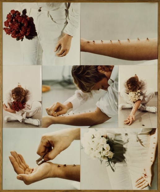
At the same time, her actions are personal. Azione Sentimentale(1973), as described in a handwritten narrative that accompanies the photographs, was a tribute to her mother.[viii] The narrative recalls a bitter sweet moment of both beauty and sadness, as she visits a cemetery with her mother. As a recording played of two women reading intimate letters, Pane carefully pierced her arm with eight thorns from a bouquet of red roses, then cut her palm with razor blades. She repeated the action with a bouquet of white roses, “then offered herself as a supplicant to the audience.”[ix]( In this case there was an all-woman audience).
The “supplicant” aspect is key to another dimension of Pane’s work, her identification with the martyrdom of Catholic saints. A few years later she created Partition, 1986 (San Sebastiaon, San Pietro, San Lorenzo), consisting of three circles which had tangible, but highly abstracted, icons referring to the martyrdom of the three saints. She identified with them, who “like her, had voluntarily accepted suffering, hoping to transform their contemporaries and make them better people.“ [x]
But, my favorite piece in the exhibition predates all of these: Enfoncement d’un rayon de soleil (Burial of a Ray of Sunlight), 1969 is a simple action: the artist digs a hole, reflects the sun into it with a mirror, then strolls away. The principle of burying sun seems so pertinent to our current state of the world. Her parallel track of environmental works is barely referenced here, and this early work does not include the debilitating physical exertion of the Actions, nor the heavy philosophical significance of martyrdom, but in its simplicity, it demonstrates a profoundly creative mind and deep love of nature.
Perhaps it was this work with mirrors that led the curator to pair Pane with Joan Jonas, who frequently uses mirrors in her work. Likewise both were pioneers in the use of video. But unlike Pane, the mirroring and video is an end in itself and self referential for Jonas. She is interesting, even poetic at times, but without a larger significance, I find her work far less moving than Pane’s.
By comparison, Pane, who would have benefited from a lot more explanation in the gallery, is a major contributor to early feminist performance art. It is amazing that this small display is her first in the United States. It also has an odd conclusion which seems to be the antithesis of her highly controlled early work: a large scrawled drawing sent to Franklin Furnace for a performance in 1979-81. Action de chasse, C’est la nuit Chérie (Hunting Action, It’s the Cherished Night) is a giant messy sketch, that again seems to superficially connect the artist to Joan Jonas, whose big rough outlines of drawings for “Lunar Dogs” are in the next room. But this work, remotely assigned to others to perform, seems the antithesis of her principles, as well as demonstrating how much her art changed.
Pane’s pairing of performance involving extreme pain with carefully controlled aesthetic presentation has failed to resonate for audiences in the U.S. because, for all our ability to spread damage and pain around the world, as well as at home, we still have our utopian illusions and a low tolerance for witnessing actual pain inside of an art venue, even in Pane’s carefully orchestrated presentation. Pane failed to wake us up from our numb state, but she certainly succeeded in creating a ground breaking art form that demonstrates her own deep concern about the world.
[i] Frédérique Baumgartner, “Reviving the Collective Body: Gina Pane’s Escalade/non Anesthésiéé”, Oxford Art Journal , 34.2, 2011, pp 252-253
[ii] WACK! Art and The Feminist Revolution, Cornelius Butler et.al, MIT press, 2007.
[iii] Ibid. illustrated p.74
[iv] WACK! pp 276, 330-352. Each time the work was performed, the context gave it a new meaning. In the Destruction in Art Symposium in 1966 in London it was part of a manifesto that declared destruction of art is linked to the “cataclysmic increase in world destructive power.” It was actually one of a whole series of works she performed “Bag Piece, Strip Tease for Three, Question Piece, Wall Piece, Wind Piece, Toilet Piece,” etc. It was most recently performed after 911 in Paris, 2003 calling it an “offering for world peace.”
[v] The Amazing Decade, Women and Performance Art 1970 – 1980, edited by Moira Roth,Los Angeles, 1983
[vi] Peggy Phelen “The Returns of Touch: Feminist Performances 1960 – 1980”in WACK!, pp.352-357
[vii] WACK! p. 279
[viii] Email communication, Perla Bianco, Galerie L’Elephant. March 16, 2014.
[ix] WACK! p. 279.
[x] Gina Pane, ‘Les Ultimes’, L’Elefante Arte Contemporanea, limited edition catalog, 93/400, unpaginated.
This entry was posted on April 10, 2014 and is filed under Art and Activism, Art and Ecology, Art and Politics Now, art criticism, Feminism, Uncategorized.
Carletta Carrington Wilson “Unchain My Heart”
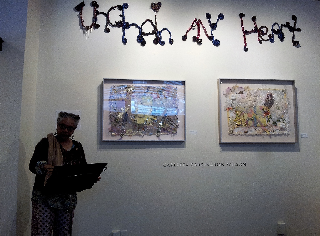
At the outset of her poetic presentation, Carletta Carrington Wilson declared that her exhibition “Unchain My Heart” (listen!) is a testament to mystery. Her exhibition at Art Xchange Gallery included selections from three series of works, “constellation of shadows and leaves” (2006) “Orange You Mingus” (2008-9), and “book of the bound” (2011-12). The artist explained that as she prepared her exhibition she realized they formed a triptych that was unified by the theme of chains, chains as shackles, as ornament, as connections.
Carletta Carrington Wilson kiss of air, tongue of fire, 2006,fabric, beads, paper, found objects, © Carletta Carrington Wilson photo by Ken Wagner
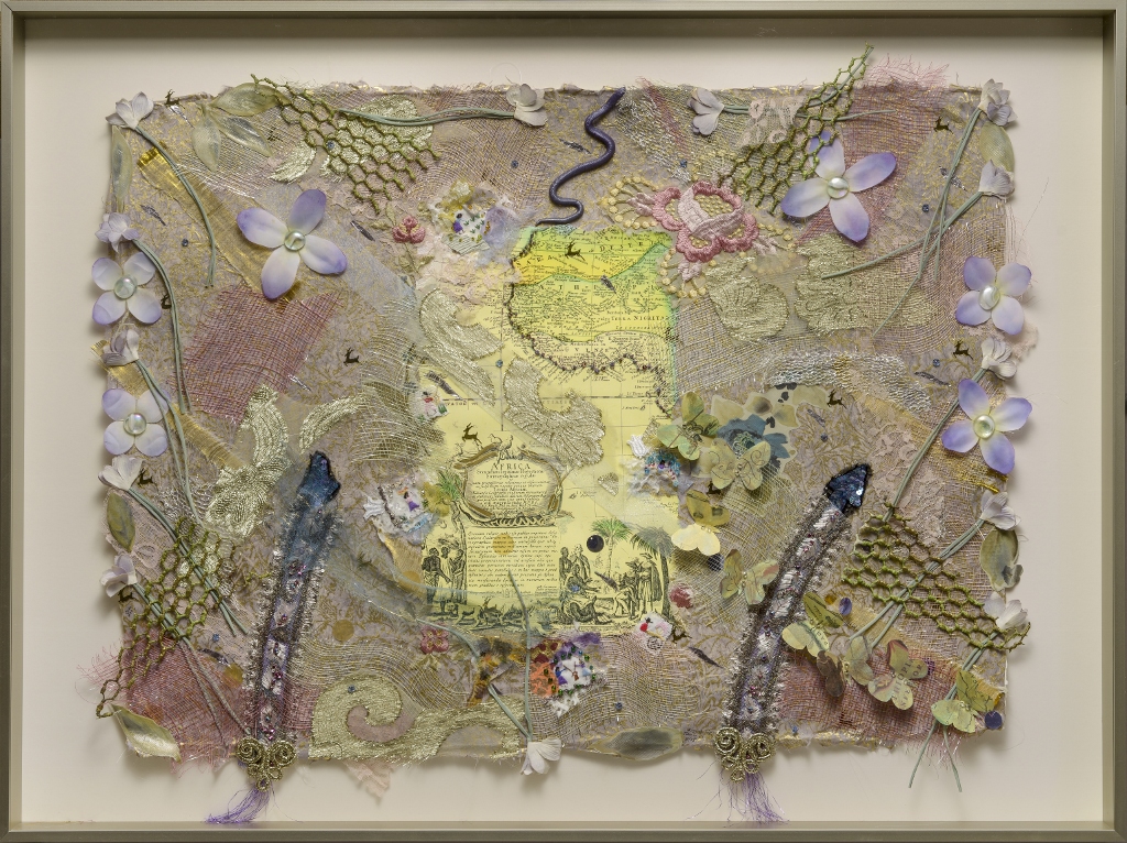
“constellation of shadows and leaves” begins the theme of chains (here one appears to mark the coast of Africa) as well as the articulation of the role of cloth in the slave trade. The works here are referred to as maps by the artist; these maps invoke the sites of slavery through fabric, beads, found objects and chains, most of all though fabrics.
“kiss of air, tongue of fire”: the strange jolt of the title suggests the contradictions of eighteenth century life. The map appears in the center, as an early cartouche of Africa, inscribed in Latin with the trading of humans as a decorative surrounding. Around the cartouche, and easily overlooked, are several tiny figures cut out from a cotton shirt making reference to the labor of the cotton fields.
The rococo era to which these decorative colors belong is France in the 18th century, as well as the height of the American colonies connection to France. Think of those movies with the elegantly attired women dancing formal patterns with equally elegantly attired men as their partners. All of that elegance was born in the slave trade, in the shipping of humans, in the harvesting of cotton, in the milling of fabric. Wilson has researched the slave trade deeply, and she has here created a subtle map of it, evoking the act of slaves through fabrics created by slaves as well as embedding references to it in snakes that penetrate the scene. Here is Carletta Carrington Wilson speaking about these works:
constellation of shadows and leaves
“My fingers move across silk, wool, gabardine, mohair, brocade, chiffon, crepe, seersucker, cotton. Sometimes the cloth is solid an occasional stripe, but mostly, and foremost floral.
“I chart cloth’s language, its artifice, mimicry and mischief mirroring the worlds we discover and rediscover in skin.”**
Wilson emphasized that the slave trade was not over, in fact it is much larger and more invisible than it was in the period of the African slave trade.
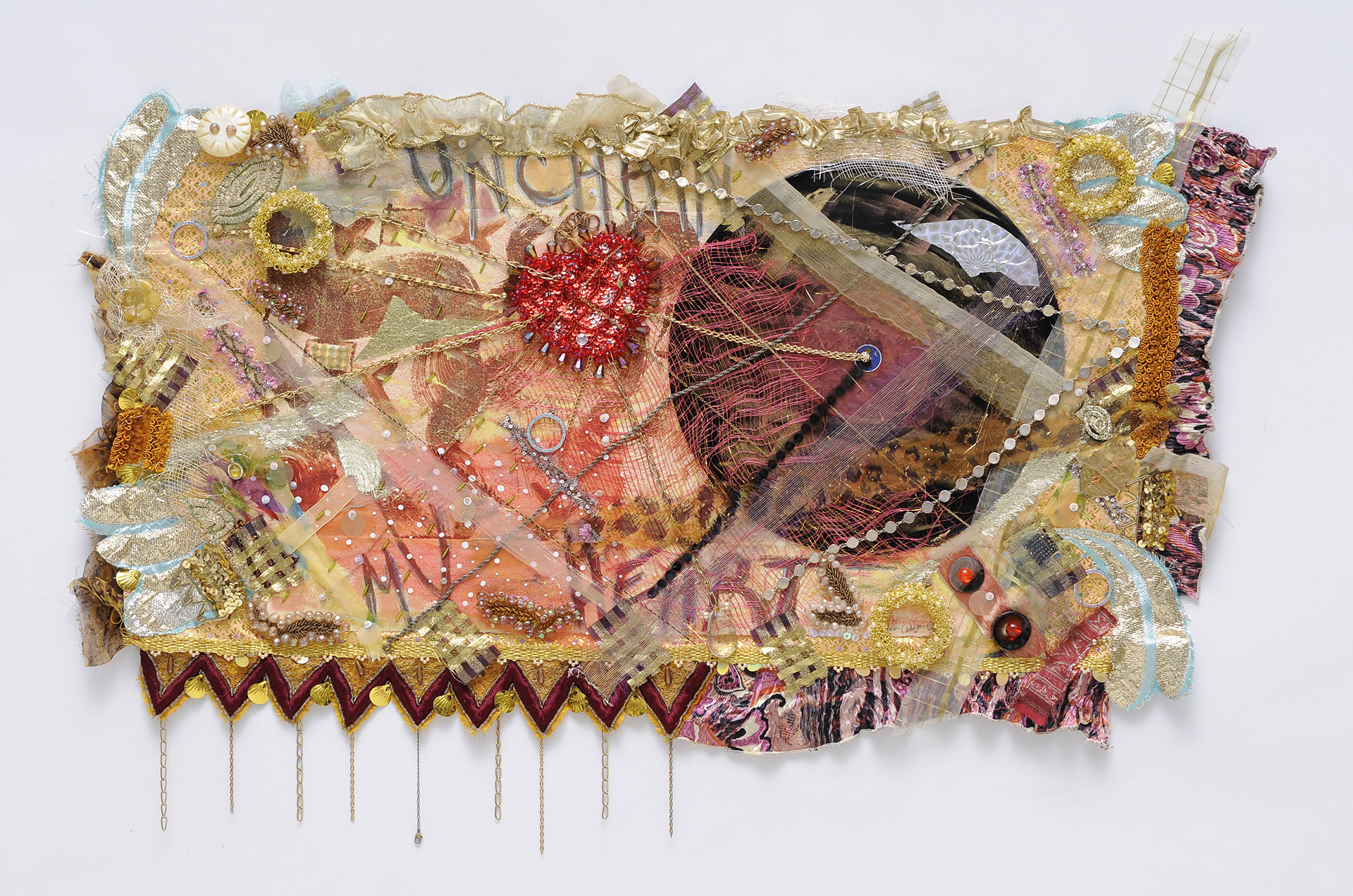
Carletta Carrington Wilson, Unchain My Heart, 2009, Fabric beads, costume jewelry, found objects, © Carletta Carrington Wilson photo by Ken Wagner
In 2009 Wilson held an exhibition called “Orange You Mingus”, making reference in the titles of the works to the music of the 1950s. “Orange was the Color of Her Dress,” is the title of a Charles Mingus piece. “Unchain My Heart” is of course, a Ray Charles Song. In this stunning collage “Unchain My Heart”, and the title work of the exhibition, we see a vinyl record embedded in the piece, and a red heart from which chains extend in many materials layered one on top of another, making it difficult to penetrate the surface both literally and metaphorically. There are also layers of transparent fabrics suggesting the swing and rhythm of music, veils, fifties and sixties fashion and much more. Here is what Carletta Carrington Wilson wrote about this exhibition:
“At heart is a linking of love and loss. Vein, thread, vector of the connector, a chain lies between the two like a noisy road.” In each link’s metallic moment, a papery passageway, a threaded trail stitched upon lips in chains of thought, lingua franca of this forged union. What love-lost ties the trying line together? Is mid-point of oppositional forces? What lock unlocks the language that created the key to the mystery of what holds the holder and the held tethered, kept, yes, claimed.
“It was not meant to be, was not meant to come to this unwieldy conclusion. Like unlikely love, like ill-matched mating, enslavement binds bodies, slaver to slave, in an unholy matrimony of ring upon ring upon ring. Wedded to want, betrothed to the unyielding length’s grasp, the wedding march accompanied by an interminable din of clinks and clanks. Let us thank the rank music that was born of these unions, unions that are yet to be reconciled to their fate. Let must be music the key to set free, body and mind, from our unharmonious history. Unleash we from the bond of bondage in which they were taught to be the buying and th bought for is not this the woe we’ve wed. Oh, set we free … please… set/we/free.”**
This particular work addresses the fact of miscegenation, the entrapment of slaves by their masters, the wedding of the two bodies, then the music as a means to freedom. As the artist poetically read this introduction, I, as a white person, suddenly truly felt for the first time, my own connection to slavery, we were all intertwined.
Carletta Carrington Wilson, Night in Tunisia, 2008, Fabric, beads, costume jewelry, paper found objects, photo by Al Doggett ©Carletta Carrington Wilson
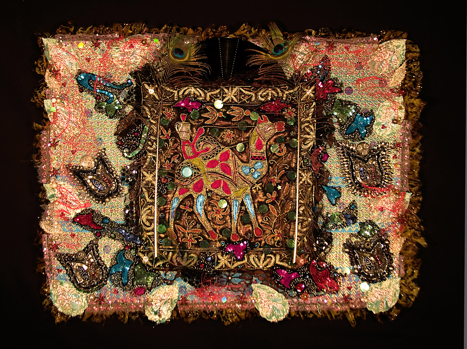
Another musical quotation is “Night in Tunisia.” A lush collage, it suggests elegant, mysterious nights as in the Ella Fitzgerald song (do listen while you look!). But a camel at the center, framed with several borders, evokes, the Arab slave trade, crossing the desert, the northern route in the Ottoman empire. The artist’s poetic words bring us to the music itself “Sound spins round, dizzy as a bird. Holler, moan, croon-cry rising in every moon-wide-eye. Jazz be this, razz, dzz a woo-dop-di-wop be bop . . .” **and much more.
So the evocation of music in the art work and the poetry is a reference, for Wilson, to the life of African American slaves as well as proud African Americans and music as a means of freedom.
The third section of the exhibition includes some examples from “book of the bound” a 2012 exhibition that I have written about previously on this blog. In the current exhibition, it is represented by examples such as“the old chain,” and “between innocence and morning fire”.
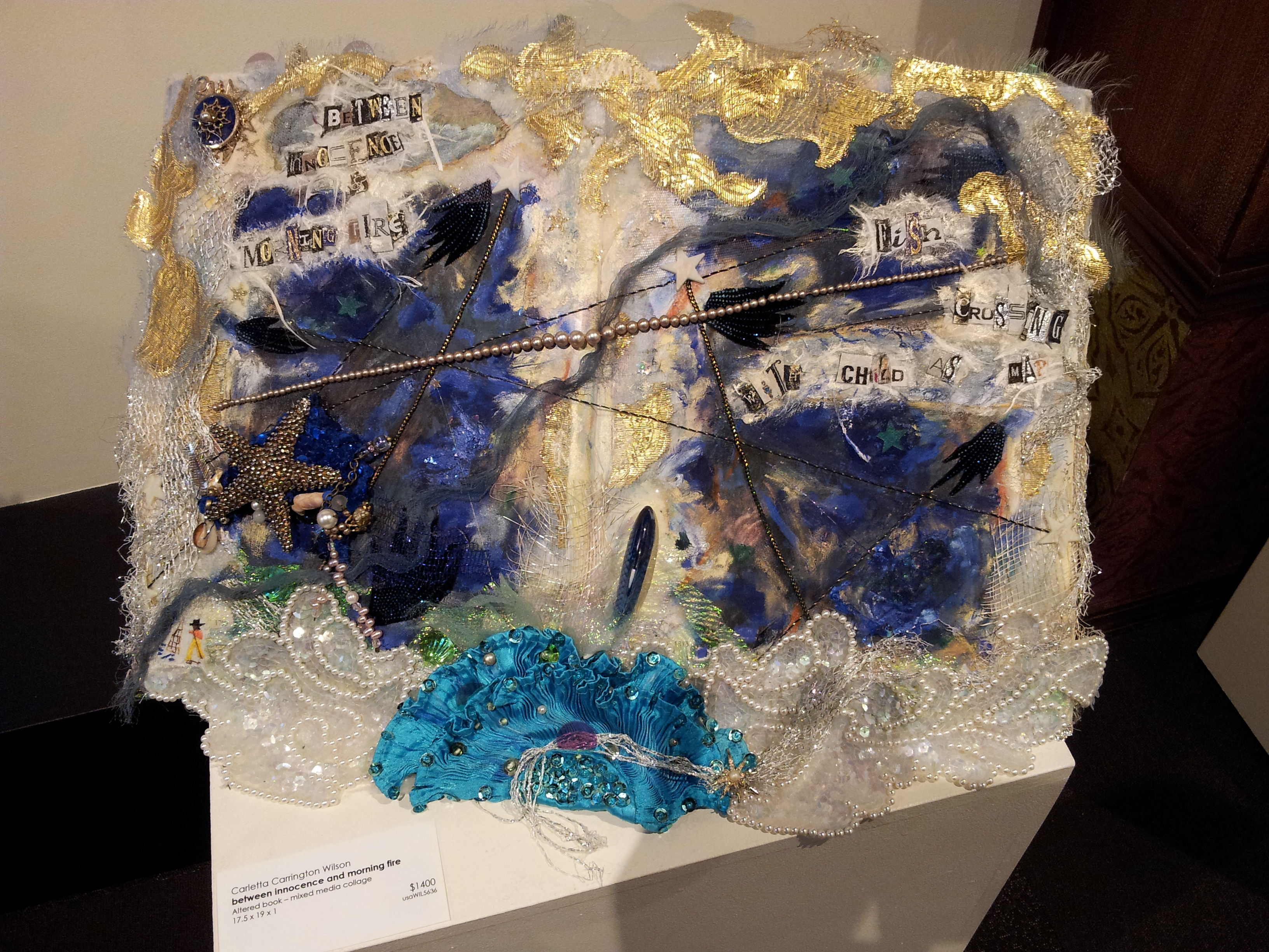
Carletta Carrington Wilson, between innocence and morning fire, 2011, altered book-mixed media collage, fabric beads, costume jewerly found objects, paint, oil pastel © Carletta Carrington Wilson, photo by Susan Platt
Both are created from books, covered with layers of ornate fabrics and chains of various sizes. In the first, we see elephants, who are, the artist emphasized, victimized still like the slaves in present day trade; in the second, we see the blue of the sea and the pearls of the ocean. “book of the bound” honored the silent slaves who never were able to tell their stories. The title of the exhibition refers to those who were bound; Wilson’s books are given as a gift to them. she found this quote for that exhibition, which makes an astonishing simile:
…for the slaves lie in two rows, one above the other, on each side of the ship, like books upon a shelf….
John Newton (18th Century sea captain. Slaver and composer of the song “Amazing Grace.”)
“The narrative of an individual captured into slavery, however, is cut out, torn off, written over and, summarily, silenced.”**
To present Carletta Carrington Wilson’s work is always daunting for me as a writer, since she is one of the most eloquent people in her own voice that I know. Her poetry, her narratives, her deep commitment to presenting slavery from so many different perspectives, all come together to create a compelling exhibition and performance. Her own voice speaking poetically is a partner to the visual art and cannot be separated from them.
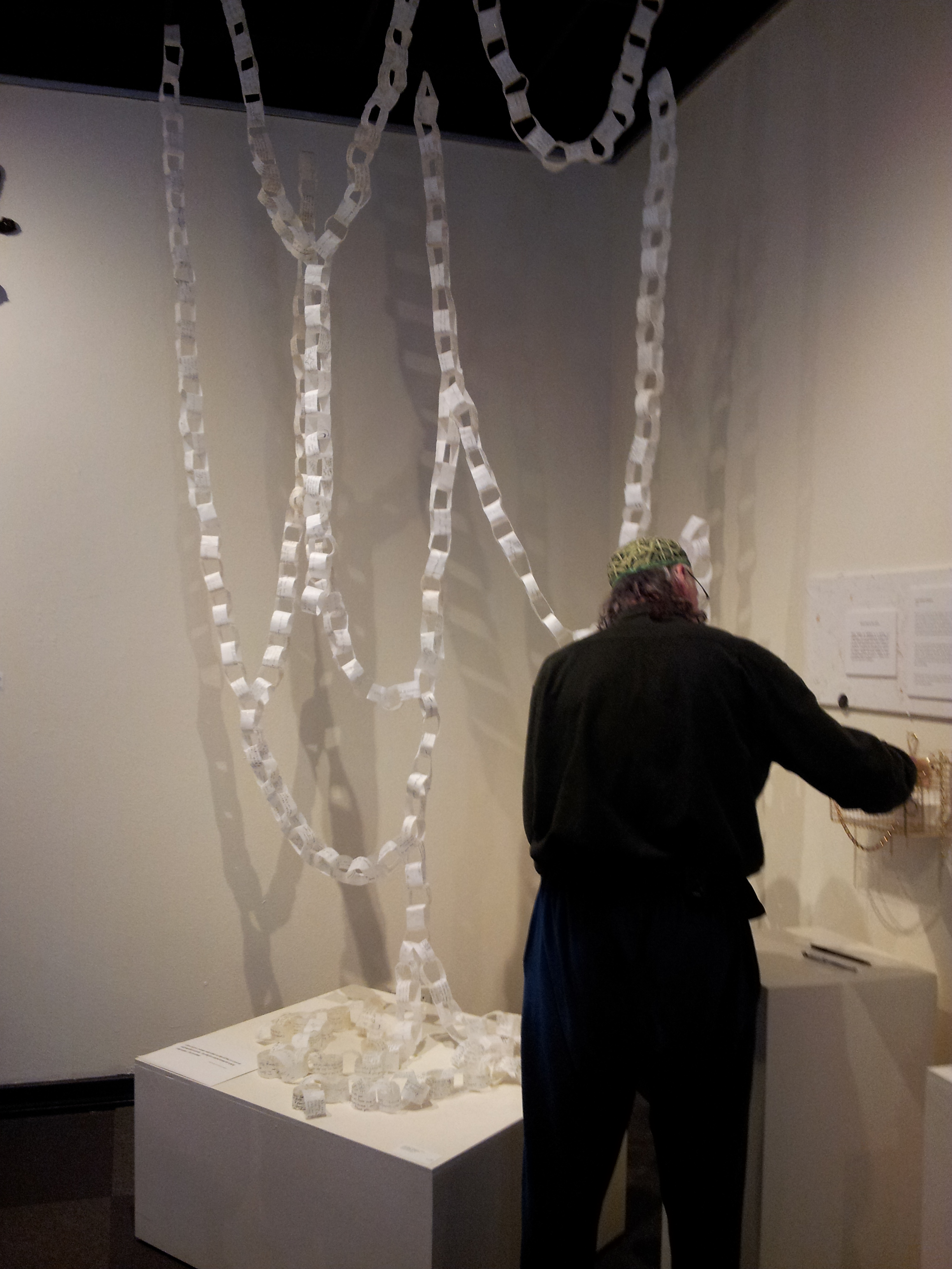
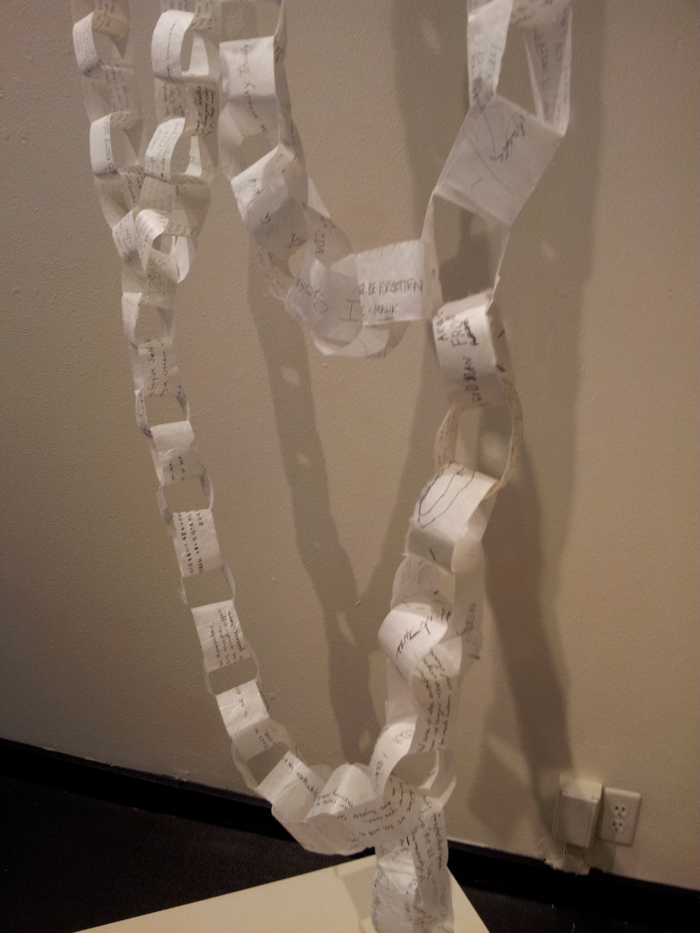
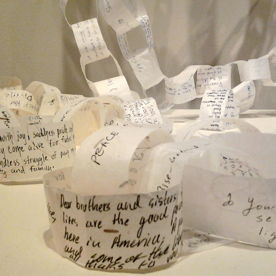
And she also includes the voices of others. In an impromptu paper chain she encourages us to write our own messages to the distant slaves. The moving result, the poetic messages, hang from a corner, and spill into our hearts with their heartfelt emotions “ To the Distant Relatives who faced the Door of No Return, I have tried to represent you and will continue to thank you for surviving the best way I can.” That is only one of the many links in this chain.
**Note: All quotations from poetry © Carletta Carrington Wilson are used by permission of Carletta Carrington Wilson
This entry was posted on April 5, 2014 and is filed under African American fiction, Arican American history, Art and Activism, Art and Politics Now, art criticism, Black Art, Carletta Carrington Wilson, Contemporary Art, Uncategorized.
The Elephant in the Room: “Stereotype” and other exhibitions by African American Artists in Seattle
The exhibition “Stereotype” curated by C. Davida Ingram at the LxWxH gallery offers a highly conceptual contribution to the several fascinating exhibitions by African American artists currently on view in Seattle. At the Northwest African American Museum in addition to “Pitch Black: African American Baseball in Washington State,” there is also “Marita Dingus: At Home” a selection by the artist of some of the contents of her home, re-installed at the museum. Dingus creates aesthetic objects out of trash, objects which often again become useful. At Photo Center NW “Seen: An Exploration of the Inside and the Out, the Then and the Now, By the (Still) Invisible Man,” included photographs by 25 men (and boys) of African descent in Seattle. ( It closed in early March.) As part of the exhibition at Photo Center NW was a projection from the online video project “Question Bridge: Black Males” still visible on line ( link below).
Jacob Lawrence and Gwendolyn Knight Prize winner LaToya Ruby Frazier has an exhibition of her photographs with the title “LaToya Ruby Frazier: Born by a River,” on display at the Seattle Art Museum until June 22.
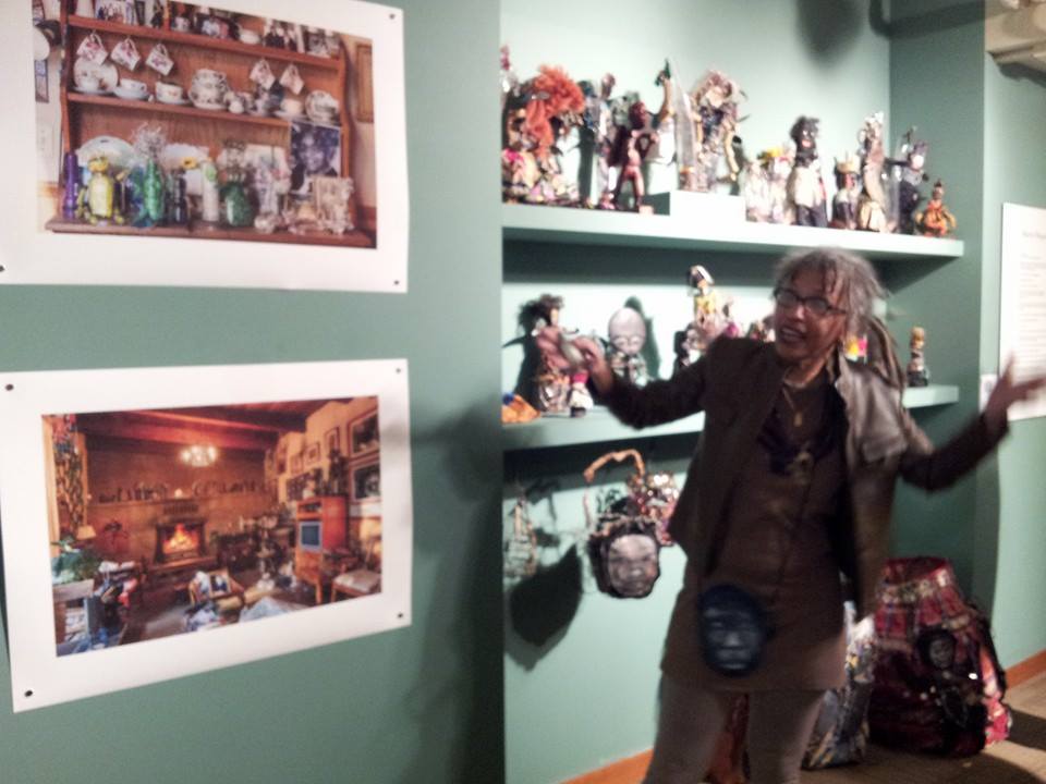
Marita Dingus’ extraordinary art reclaims materials and transforms them into both useful and aesthetic formats. Her exuberant style and amazing eye for the potential in any material is a profound act of reclamation.
In “Seen,” curated by Maikoiyo Alley-Barnes, with Michelle Dunn Marsh and Ann Pallesen of PCNW the photographs ranged from traditional format black and white images to informal polaroids and small snapshots, most of them from the personal lives of the photographers who ranged in age from very very young to old. At the opening, most of the photographers were there, and we could talk to them about their work and what it meant. It was a rare opportunity for dialogue across the “color line” in a non-confrontational atmosphere. “Question Bridge: Black Males”

is an ongoing video project that according to the website “explores critically challenging issues within the African American male community by instigating a trans-media conversation among black men across the geographic, economic, generational, educational and social strata of American society. “ Question Bridge” provides a safe setting for necessary, honest expression and healing dialogue on themes that divide, unite and puzzle black males today in the United States. “Question Bridge: Black Males” was created by Chris Johnson, Hank Willis Thomas, Bayeté Ross-Smith, and Kamal Sinclair.”
In contrast to the informality of the photographs in “Seen” and the talking heads videos of “Question Bridge,” as well as their multiple perspective and historical places, La Toya Ruby Frazier’s photographs are straight forward statements about a specific place, issue, and idea.

The first part of the exhibition is a series of black and white about her family:the second half are large aerial view color photographs (as her career has grown increasingly successful, she has been able to do large format aerial photography). Photographing in Braddock, Pennsylvania, where the first and last Carnegie Steel Mill operates, Frazier documents both the intimate acts of caring by people, here her grandmother, inside the houses of African Americans who could not afford to move away from the toxic environment near the steel mill, and the view of the deterioration and gentrification of what is still a community being destroyed in the early 21st century by neoliberal capitalism. LaToya Ruby Frazier provides a direct statement about racism and the toxins of both industry and gentrification.You can read my longer review of her work here (scroll down).
As an aside here, I have to add that Sandra Jackson-Dumont who has curated all three of these Gwendolyn Knight and Jacob Lawrence awards, as well as wonderful education programming, has done a brilliant job. She is now going to the Metropolitan Museum of Art in New York City and will leave a big vacuum where she has been in our community.
“Stereotype,” in contrast to these exhibitions, is text based: it explores the concept of “stereotype,” by artist/poets who combine in your face statements, and metaphors that slip away from being clearly understood. Of course, a stereotype is something everyone thinks they understand: labelling, a shallow cliché. The bold type in the title is Davida’s own initial slipping us away from knowing. She refers to the original meaning as a “relief printing plate,” then moves on to “perhaps something as onerous as a stereotype can be overcoded, remade, and straight up appropriated. “ That pretty much sums up what is purposefully explored in this show.
At the opening, of “Stereotype,” the room was filled with smart artists and poets of all ages and colors. Although planned since October by Davida and Sharon Arnold, curator of the gallery, the exhibition was a perfect expansion of the “Seattle Women’s Convention.” Davida was among about three women of color who attended the “Women’s Convention” event in the winter (still going on Facebook and subsequent gatherings). It consisted of a large number of mostly white, mostly young women gathering in the Hedreen Gallery at Seattle University to discuss “feminism” a term they were mostly afraid of having as an identification.
Tariqa Waters
They met in front of a huge painting of famous slave owner Andrew Jackson wearing a pink dog collar by Tariqa Waters (an African American artist who eventually was invited to join the discussion up front); here she is explaining her painting , where it hung for one night. A recent arrival in Seattle, she has a dynamic style all her own. Here is an interview with her.
I had not met Tariqa before, but C.Davida Ingram, Sandra Jackson-Dumont, Barbara Earl Thomas, these are women who constantly appear at the dominantly white art events in town, negotiating through them with finesse, grace and subtlety.
So it was about time to be at an event where the exhibition was all women of color, with a theme like “Stereotype.” Now, one can ask, why all black women? White women get stereotyped too! But the fact of black women commenting on stereotyping had coherence and depth that would have been less emphatic in a mixed show.
So for me as a white person, what did I understand in the show? I felt that I was negotiating with another culture, I was navigating black culture with some markers that were easy to understand (stereotypes). White becomes the Other here, slipping off the preconceived ideas of our stereotypes and clichés .
What was Davida saying, what were the other artists saying?
First of all, text was the primary assignment to the artists, so there was a lot of reading. But the first element was a video, directly in front of the door, called, appropriately enough, “The Elephant in the Room.” It had two parts, in one part an elephant who attacked some people is shot, in the second part an elephant is released to be reunited with his mate after many years. The video was captioned, and at the moment of release, the zoo tender says “there’d be no more chains.”
That is the frame reproduced in the catalog, just in case we didn’t get the point here. Obviously the metaphor is about the “other,” racism, race. But Davida slips us along and expands that obvious statement, by declaring the elephant is “many things, especially narrative itself ( ie who gets to tell the story and how.)”
Near the video is Barbara Earl Thomas’s art work and texts. Davida referred to her as the matriarch/goddess in her introduction. Indeed, that is one of the great contrasts with the
“Women’s Convention.” C. Davida Ingram honors and builds on the older generation. She knows them and loves them. Among the (white) women who discussed feminism in February, although a matriarch/guerrilla girl dramatically revealed herself, the young women seemed to still be adrift in an isolating fear of the idea of feminism.
After the grounding of Barbara Earl Thomas’s texts, easy to understand and follow about childhood incidents of race, I moved on to the work of francine j. harris. Two mirrors, one with white writing, the other with black writing, listed definitions for the many terms for different colors of skin among people of African descent. Francine j. harris is a poet. The work called “hon*ey” included about 18 different colors, like caramel, cocoa, chocolate, with “definitions” of those terms that appear to be random. Appropriately, we could barely read the texts, they flickered in and out of vision because they were written on mirrors. The reproduction in the catalog likewise is virtually camouflaged by reflections. One detail is visible: caramel” 1. A company of travelers journeying together as across a desert…. 4. Naut. Any of several types of small light sailing ships, esp one with two or three masts . . . used by the Spanish and Portuguese in the 15th and 16th centuries. “ So here are references to the slave trade, in this definition of caramel, which is, of course a type of candy; that definition is never mentioned. So here I am challenged, in and out of understanding.
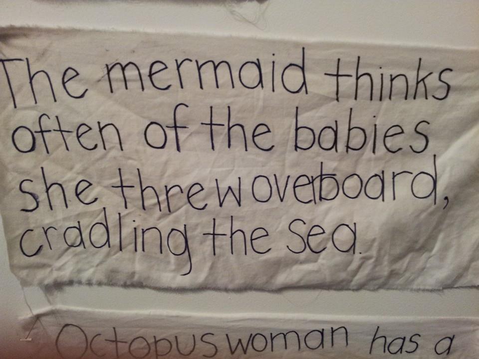
Davida Ingram Conjures and the Mermaid Gesture Drawings on bedsheets
Another work by Davida written on sheets, “Conjures and the Mermaid” consists of 14 segments. On each square of sheet are small phrases that sound like story fragments. Sometimes they are funny in a nonsense way, but then we get the thrust (literal and metaphorical) “I’m sorry my dragon ate your dog,” the mermaid said as she waited for the ship with cannibal rats.” “the mermaid looks at Octopus woman using her terrestrial eye” “The seahorse explains that she will leave something that unwomans her. The mermaid replies I Negress.” These tales of the sea are all awash in metaphor, fantasy, references to the slave trade, and many other meanings of which I know little.
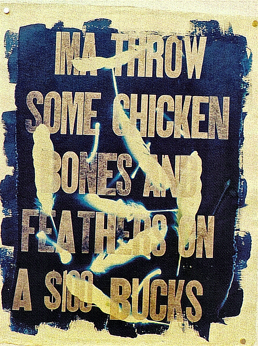
Krista Franklin Chicken Bones and Feathers 2013
Krista Franklin pairs a poem with a text/image that says “Ma Throw some chicken bones and feathers on a $100 bucks”, with white slashing strokes over it that makes it read like a piece of graffitti on a wall. Nearby is an excerpt from a poem called “The Two Thousand Thirteen Narratives of Naima Brown.” Both image and poem are letterpress prints on handmade paper: that medium declares them to be fine art. But the narrative is written in tiny hard-to-read letters, and once deciphered it is hard to understand. The “Ma” text is easy to read, but what is it about?
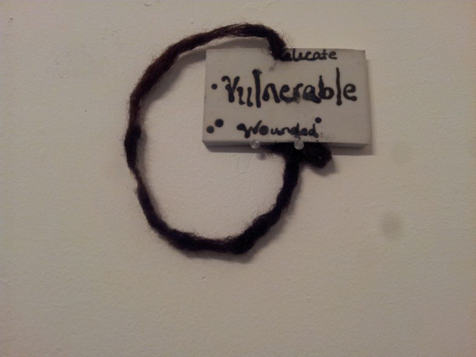
Natasha Marin Meditation on Vulnerability
On the end wall, a work by Natasha Marin “Meditation on Vulnerability,” hand made ceramic tiles, with handwritten text and human hair. This piece again is more than the sum of its parts. As the artist states, “As a black woman I am keenly aware that I have been denied the space of “Vulnerable” within the vast landscape of stereotypes associated with my particular demographic. This is the beginning of an exploration into text-based ritual practice.” We can see it, we can read it, we can feel it, but we can’t know it.
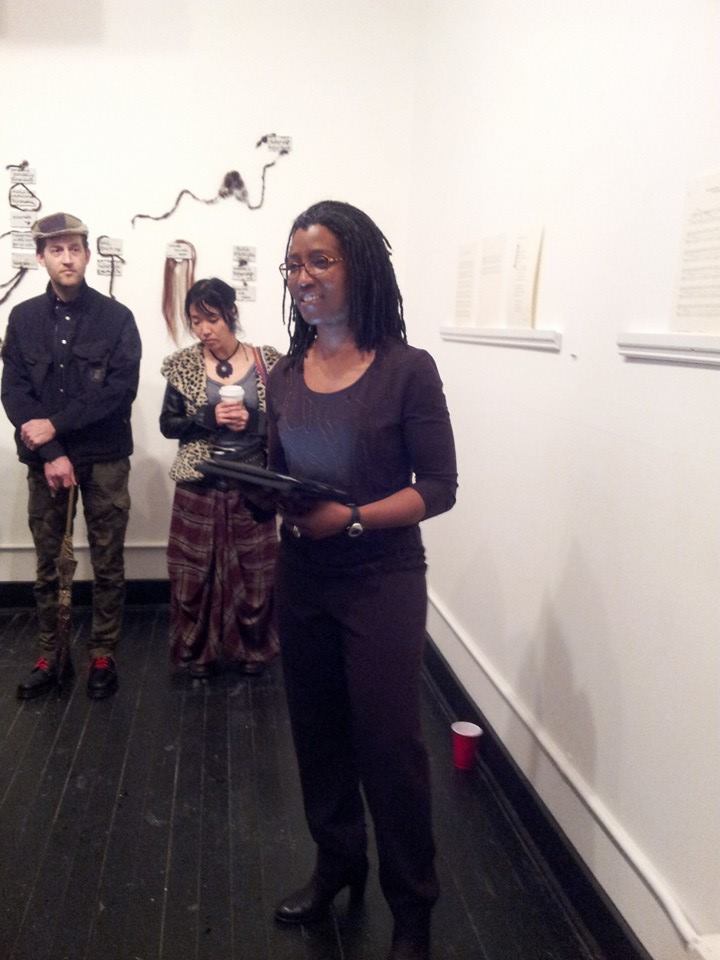
Duriel E. Harris reading her poetry
Duriel E. Harris, a poet from Indiana, provided a stunning reading of some of her works. “Self portrait in Relief,”which she read, and a few others, are available online to think about. Harris’s work in the exhibition takes that familiar point of departure for racist steretypes, the nursery rhyme, and provides us with some powerful alternatives, as in “ten little nigga (knots).” While the nursery rhymes were pretty clear cut, in her poems and performance Harris fills every word with possibilities; her poems are pointed, but her words are scrupulously chosen to both provoke and mystify. Her poems are not narrative, nor do they rhyme; they rely on words that stand as violent survivors of a creative act that wrested them onto the page from their usual comfortable armchairs of sentences and predicatable meanings.
There were a lot of codes. I read, I listened, but this show ducks behind curtains, mirrors, and words that have multiple meanings. It is one of the most provocative exhibitions I have seen in Seattle in a long time. It is open only on Saturday afternoon noon to three until the end of March if you want to see it. 6007 12th ave S, that’s in Georgetown on a second floor on a side street, but you can find it. It is worth it. See it on the same day you see “La Toya Ruby Frazier: Born by a River” at the Seattle Art Museum, or “Marita Dingus:At Home” at the African American Museum, so you can have several ways of thinking about the power of art to tell us more than we know.
This entry was posted on March 13, 2014 and is filed under Arican American history, Art and Activism, Art and Politics Now, art criticism, Black HIstory Month, Contemporary Art, Uncategorized.
“Our America” Abstraction and Identity
Olga Albizu Radiante 1967 oil on canvas Gift of JPMorgan Chase
In 1988 I published an article in Art Journal with the title “Modernism, Formalism, and Politics: ‘The 1936 Cubism and Abstract Art’ Exhibition at the Museum of Modern Art.” You can read it here. In my article I demonstrated the way in which Alfred Barr, in the midst of Hitler’s active destruction of modern art which he personally witnessed in the early 1930s, sought to save modern art by enshrining its history outside of history, as a history of abstract forms. Although in the 1920s Barr embraced “Neue Sachlichkeit” ( new realism, with artists like Otto Dix), Dada, Surrealism and various other directions, in the 1930s Barr basically invented the idea that pure abstraction was the main goal of artists in the early twentieth century. He traced its emergence descending from post impressionism in two branches, one through Cubism, Suprematism, de Stjil, and Constructivism; the other through what he described as (abstract) expressionism, (abstract)dada, and (abstract)surrealism.
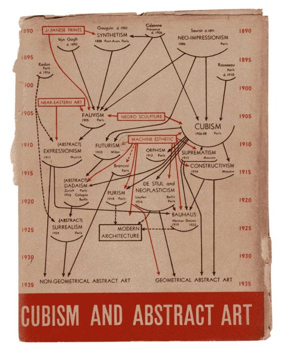
This “evolution” was first presented in a complex diagram, familiar to all of us, in which Alfred Barr acknowledged other reference points in red boxes ( Near Eastern Art, African Art, Machine Art) but his flow led inexorably to what he called in 1936 “geometrical” and “non geometrical” abstract artists.
Barr arbitrarily established the centrality of abstraction in this hugely influential exhibition and catalog. After World War II, formal analysis and abstraction as a superior (democratic!) force and expression of “freedom,” exploded with the influential support of Clement Greenberg, the CIA, and the Communist witch hunts of the McCarthy era which led artists to avoid politics and even any imagery at all.
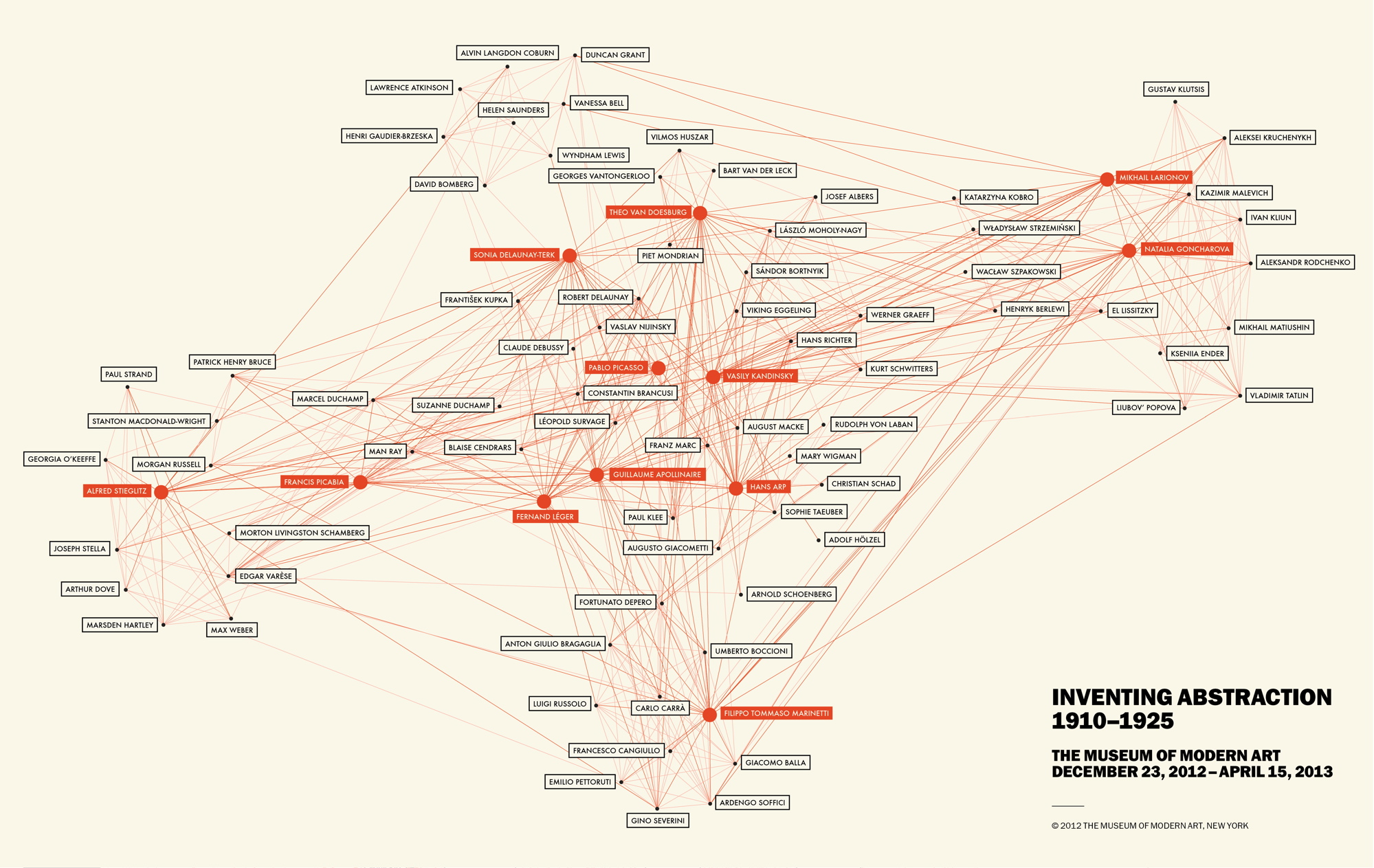
The 2010 exhibition “Inventing Abstraction 1910 – 1925” at the Museum of Modern Art re-enshrined abstraction as the ultimate event in early modernism and included a new interactive chart. By not including any references outside of the artists interrelationships, it was actually even more insular than Barr’s.
Criticism of the exhibition pointed out that this was “white European abstraction” and that abstraction existed all over the world. That is a crucial opening for more discussion of what abstraction means, how many different types of art it encompasses, and, above all, how many different interpretations it offers. The term itself tends to stop us, much as the 2010 exhibition did, our brains turn off, and we see abstraction as a monolithic position in European/US culture.
Of course, early twentieth century modern art in Europe and the U.S. as a whole, with abstraction as one aspect of it, has been of great significance in Latin American modernism, among cultural elites. (See my review of the exhibition at the Museo del Barrio) Latin American modernism of the twentieth century has a distinct character, beginning in the 1920s with the work of the Uruguayan Joaquín Torres-Garcia
Joaquín Torres-Garcia
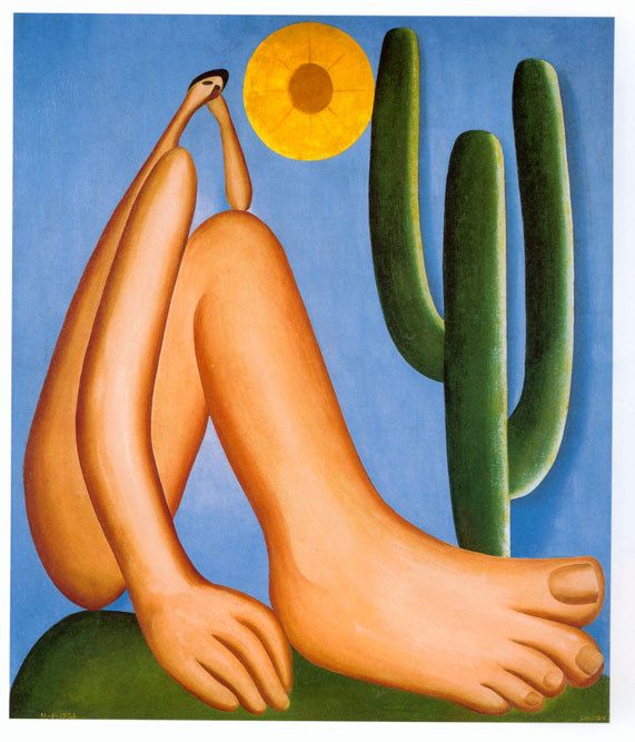
Tarsila do Amaral,
and the Brazilian Tarsila do Amaral, the central figure in a major movement with a manifesto, “Anthrópafago.”
Torres-Garcia’s work bring together Constructivism with a private vocabulary of symbols. Tarsila transformed a modern style learned in Paris, especially from Leger, with imagery based in indigenous and Brazilian popular art references as well as surrealism. But neither Torres-Garcia nor Tarsila are purely abstract artists relying only on shape, color, etc. Their art is layered with context and multiple geographies, texts, references, and personal perspectives.

So now let us turn to the abstract art in “Our America.” Each of the artists included has a different trajectory, perspective, context, country of origin, class, life experience. Together they underscore the complexity of what abstraction means. Some critics have suggested that artists of color are denying their identity by turning to abstraction; actually we see here that the artists are embracing who they are as they alter the parameters of abstract art.
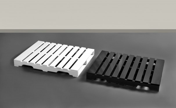
Jesse Amado, Me,We 1999,granite and marble Gift of Henry R. Muñoz III in honor of Lyman Morgan Jones V© 1999, Jesse Amado
Me/We by Jesse Amado on first glance appears to be a minimalist sculpture, geometric, stone, impersonal. But on closer examination, it is clearly an exact replica of wooden shipping palettes. The two halves of black granite and white marble sit adjacent close to the floor, but do not touch. We tower over the sculpture, forced to look down. The work honors workers who lift these palettes not only in its form, but also in its title. “Me,We” is a two word poem that Muhammad Ali read at Harvard when he was given an honorary doctorate. (exhibition catalog. p. 95) In just these two words, Ali, and now Amado, speak of our connection to society, our shared world. through these spare expressions.
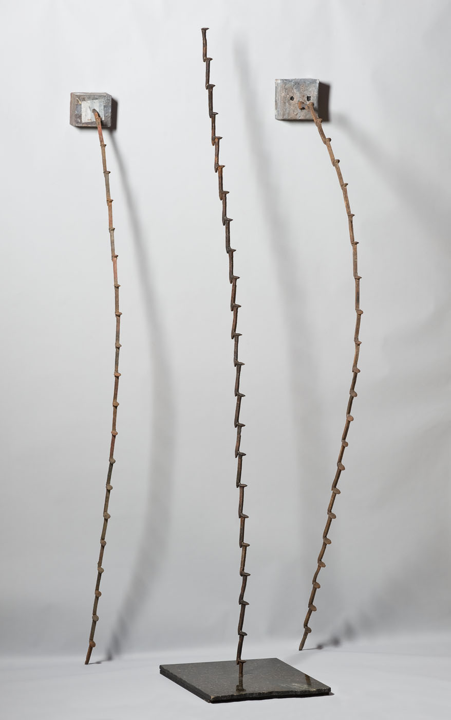
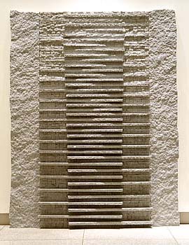
Ruben Trejo Mandalas1986-1990 welded iron railroad spikes, marble, iron sheet, lead, and wood Gift of the estate of Ruben Trejo
Mandalas by Ruben Trejo is another transformation: in this case actual railroad spikes welded together to form two lines hanging down, and one standing upright that recalls, except for its slight sway, Brancusi’s Endless Column. The sense of gravity shaping the work, and acting on it, is subtle and crucial. With his title, Trejo sanctifies the material of his father’s humble work hammering railroad spikes. These spikes not only have an energy of their own, they seem about to break loose. This sculpture is not simply to be looked at, it is to be experienced viscerally: it gives us contradictory sensations and feelings, much as the artist himself must have had coming from humble beginnings (he was actually born in a box car) to the making and teaching of sculpture in a small town in Eastern Washington State isolated from his Mexican roots. (exhibition catalog p. 323)
Charles ‘Chaz” Bojórquez follows an entirely different trajectory. He began as a graffiti artist in LA, but his large oil paintings, with repeated undecipherable writing, appear to be a private language, a work of esoteric conceptual art. Those two widely separated worlds come together in this work, Placa/Rollcall . The idea of graffiti marking territory for gangs here metamorphoses into a painting
Charles “Chaz” Bojórquez, Placa/Rollcall 1980 acrylic on canvas
Gift of the artist
using a personal calligraphy that the artist has developed based on his interest in old English letters and Asian calligraphy. Within the calligraphic shapes are names of people that he cares about, but only the initiated can read it. Again, for the mainstream viewer the work is abstract, for the urban street world of Bojorquez and his friends the work speaks of territory, friendship and pride. (exhibition catalog, p 111)
Jesús Moroles Granite Weaving 1988 Georgia gray granite
Gift of Frank K. Ribelin
J
Jesús Moroles granite wall of stone Granite Weaving has the presence of a Mayan or Aztec pyramid. We see both the material and a sense of history in the work as soon as we stand in front of it. Moroles was an assistant to Luis Jimenez, an experience that led him to large scale sculpture, but in the opposite material and aesthetic from Jimenez. While Jimenez works in fiberglass and directly evokes both his own presence and historical references in his Man on Fire, for example, Moroles works in the stone of the earth, the stone of permanence, of ancient art and architecture. He has a personal relationship to the stone, saying “The stone speaks to me and I speak back.” (exhibition catalog, p 259) which recalls Michelangelo’s relationship to marble. Yet, Moroles’s works evoke ancient forms, (another is a stele,) or ancient cultures, that achieved monumental permanence in Mesoamerica, Egypt, and Asia. He is not culturally specific, or historically limited. Moroles monumental modernism has within its abstract forms the possiblity of experiencing history as a continuum to the present moment.
Turning to other painters in the gallery, we have in addition to Freddy Rodriguez, discussed in the previous blog, Carmen Herrera and Olga Albizu. In the case of painting, the risk of comparison to known white men is greater. Departure from the canonical techniques and forms means that the artist doesn’t “get it.” But if the art is absolutely contemporary with the current styles, and simply by a lesser known Latino/a artist, then it is “derivative.” These phrases seem to attach onto painting more quickly than to sculpture.
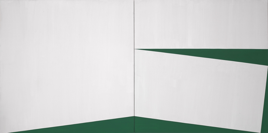
Carmen Herrera Blanco y Verde 1960 Museum purchase through the Luisita L. and Franz H. Denghausen Endowment 1960
Carmen Herrera was a woman who moved comfortably between Havana, Paris and New York. She is older than the generation of Cubans who emigrated to the US following Castro’s revolution in 1959. She was part of an international community of artists from many countries who came together mainly in Paris and New York City, as a modernist avant garde in the middle twentieth century. Her formation coincided with post World War II French artists pursuing a hard edge abstraction that they called “réalités nouvelles” [new realities], so in that she is continuous with Torres-Garcia in his 1920s affiliation with hard edge Constructivism.
Blanco y Verde was painted in 1960 at the height of abstract modernism in New York City. Herrera has a cool palette, and a hard edged form, but at the same time, her work is unlike other artists of that time, it sets us off balance, and suggests that we cannot quite dismiss everything that seems to have been taken out of the art. Herrera speaks of rejecting the spiritual, the mythological, the religious, and in this cool work, she presents the rational. But, actually, with its off kilter relationships it still invites the sense of uncertainty that is the opposite of the rational. It is also extremely elegant, echoing the artist’s personal style. One has to ask, is hard edged abstraction an elite practice, possible only with the most fortunate? Or is it a tenuous place, a balancing act that can lead into the abyss at a moment’s notice?
Herrera did not start selling work until she was 89 years old, but is currently regarded as a hot, contemporary artist. Just goes to show, if you live long enough, anything can happen! Her success also underscores the continuing love of abstract art in contemporary art.
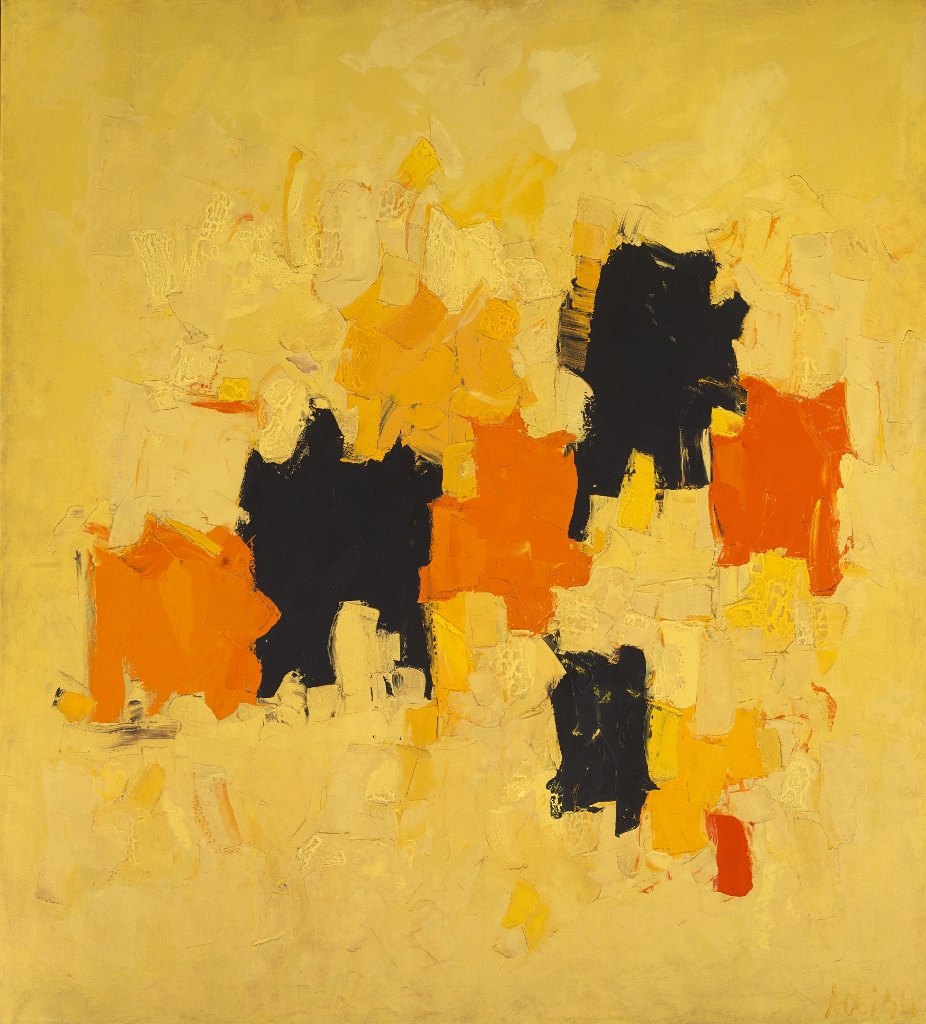
Olga Albizu Radiante 1967 oil on canvas Gift of JPMorgan Chase
And finally, but by no means all of the artists in this gallery of abstraction, is Olga Albizu’s Radiante, 1967. Albizu studied with Esteban Vicente at the University of Puerto Rico, an artist who later went to NYC, and was part of the early abstract expressionist movement. Albizu also came to NYC and studied with Hans Hofmann. Radiante is on the poster for the exhibition which brings us back to Curator Ramos’s intention to demonstrate that Latino artists participated in all the major styles of the late twentieth century: Albizu’s Radiante is an abstract painting with the colors of the Caribbean; it has highly saturated and particular yellows, oranges and blacks against a yellow field, applied with a thick palette knife.
Her work was featured in 1964 on the cover of a Stan Getz/ João Gilberto’s jazz album, one of the best selling bossa nova albums of all time, since it featured “The Girl from Ipanema.”(exhibition catalog p. 89) Albizu’s work is contemporary with the height of abstract expressionism, but she did not, as a young woman from Puerto Rico, hang out with those famous alcoholics at the Cedar Bar. There is a controlled and subtle sensuality to her work, that speaks of hidden layers of emotion, rather than letting everything appear on the surface to be consumed. In the case of Albizu, the connection to music, and particularly Bossa Nova, as well as her exposure to Hans Hofmann’s ideas of “push and pull,” allows for the work to exist without other reference points. The colors do indeed move like large full sounds, a connection that takes us all the back to Kandinsky.
So, clearly, Alfred Barr’s deterministic evolution toward abstraction continues to be influential to the present moment. But, a more accurate representation of modern art would be an inclusive, complex story, with roots and branches for each artist according to their own experience. The fact that “Our America” has such a large gallery of abstract works does, however, reflect the importance this practice has been given in the history of art. It is, irrefutably, still perceived as the mainstream, and it is against a monolithic concept of abstraction that so many other artists have reacted.
Note: the catalog for the exhibition Our America: The Latino Presence in American Art by E. Carmen Ramos, with an introduction by Tomás Ybarra-Frausto (Smithsonian American Art Museum, Washington D.C., 2013) cited at several points in this review, is invaluable. It can be purchased from the Smithsonian Museum of American Art.
This entry was posted on March 10, 2014 and is filed under Art and Politics Now, art criticism, Contemporary Art, Latino Art, Uncategorized.
“Our America: The Latino Presence in American Art:” A Radical Proposal`
The first juxtaposition in the lecture by E. Carmen Ramos that introduced “Our America,” an exhibition at the Smithsonian American Art Museum, told the story she wanted to tell: the 1986 painting by Frank Romero of the police shooting of Rubén Salazar in 1970 next to “Washington Crossing the Delaware.” Two significant historical events of equal value. Washington Crossing we are all familiar with. The shooting of Ruben Salazar, the pioneering journalist, originally from Mexico, who worked for the Los Angeles Times for many years as an investigative journalist, is much less well known. Placing these two historical events side by side declares that our perspectives are still exclusive and limited, when it comes to American art and its partner, American history.
E. Carmen Ramos, Curator of Latino Art at the Smithsonian American Art Museum, is building a new narrative for the history of American art. We are accustomed to the oft repeated lineage from colonial portraits to revolutionary history painting, to genre painting in the nineteenth century, still life, then in the twentieth century we have Alfred Stieglitz and modernism, the art of the New Deal, after World War II, Abstract Expressionism then Pop art, minimalism, feminism, conceptual art, postmodernism, and up to the present undefined history.
We know that in the 1960s and 1970s the Civil Rights movement and the Feminist movement sparked new narratives and new inclusions in that traditional trajectory. The Gay rights and AIDS added more dimensions. But today, we still don’t have an integrated history of American Art. We have mainly white men, with extras, a few woman, a few African Americans, a few gay artists.
Latinos sometimes get added in also, in the midst of the Civil Rights movement when the Chicano movement emerged full force.
But Ramos has another idea about the way to write an inclusive history of American art: Latino art is not an add on, it is embedded in all of the art that we have, all of the styles, directions, and politics.
By integrating Latino art into the mainstream, we get a different perspective. Ramos’s exhibition, “Our America” based on a selection of the permanent collection of the Smithsonian American Art Museum, emphasizes artists from Mexico, Puerto Rico, Cuba and the Dominican Republic. Artists from Central America, with one exception, are not included. Nor are artists who have come from Latin America. They will have to wait for the next installment.
This exhibition is a first step in the process of inclusion of Latino/a artists in the mainstream. It is going to travel all over the United States and hopefully change our conversation. Its timing is perfect. Just as our culture is demonizing immigrants forced to come here by our trade policies which are wiping out their living at home, we are offered these sophisticated works of art by immigrants, and descendants of immigrants, that declare that Latino/as are immeasurably enriching our country . As they assimilate US culture, they are also changing it, in exciting directions.
These art works address specific moments in Latino/a, US history or current conditions. They are all from the last half century.
Ramos has divided the exhibition into categories that underscore her purpose: Reframing Past and Present, Migrating Through History, Everyday People, We Interrupt this Message, Signs of the Popular, Turning Point, Street Life, Defying Categories.
In Reframing Past and Present she has included the most specific art about immigration and violent acts of racism
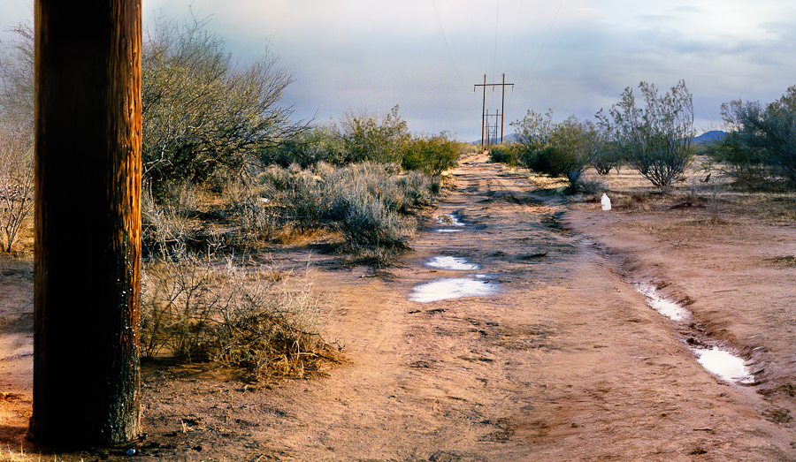
Delilah Montoya Powerline Trail
Delilah Montoya’s Human Water Station, can you see the plastic water bottle in the distance, on the path of people crossing the desert north of the border?
The tree photographed by Ken Gonzalez-Day could have been used for lynching. It is just one work from his project Searching for California Hang Trees. a groundbreaking book and photographic project on the lynching of Latinos in California in the 19th and early 20th century. In the book he describes going to the trees he has located and trying to experience the moment of lynching. One of the trees is in the center of downtown Los Angeles.
Ken Gonzales-Day, “At daylight the miserable man was carried to an oak…” from the series Searching for California Hang Trees, 2007, inkjet print, Smithsonian American Art Museum, Museum purchase through the Luisita L. and Franz H. Denghausen Endowment
© 2007, Ken Gonzales-Day
Enrico Chagoya’s long codex is full of dense references to colonialism, slavery, immigration etc. Here is one small section with the complete title of the work. Chagoya, as usual, weaves a complex tapestry of humor, politics, wicked insight, and technical virtuosity.
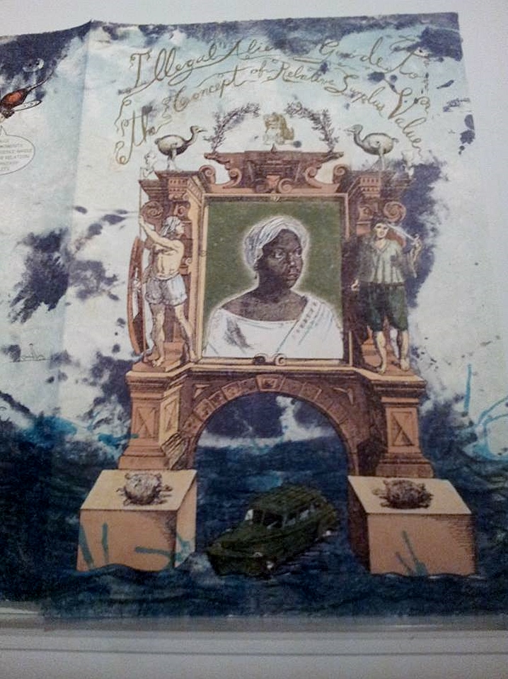
Chagoya Illegal Aliens Guide to the Concept of Relative Surplus Value 2009
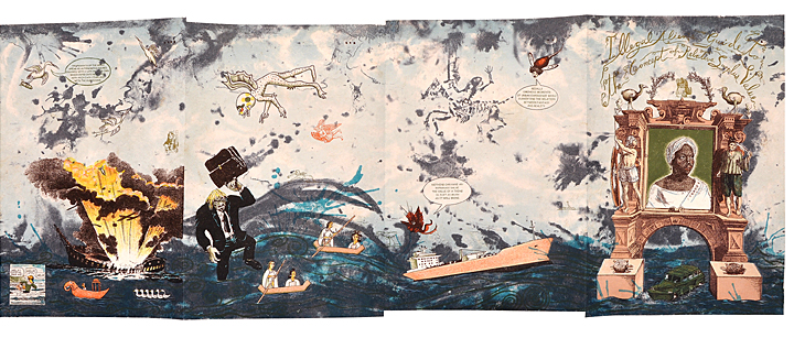
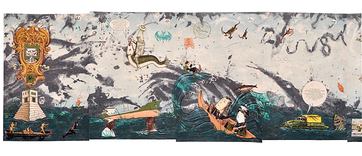
Another section of the exhibition is called “Migrating Through History” and it includes what is described as “dreamlike” imagery and a reflection of the conditions that cause migration. Maria Magdalena Campos-Pons Constellation uses hair as a metaphor of the middle passage as well as the passage from Cuba to the US. It creates an evocative and frightening reference to migration and its threats.
María Magdalena Campos-Pons, Constellation, 2004, instant color prints, Smithsonian American Art Museum, Museum purchase through the Luisita L. and Franz H. Denghausen Endowment. © 2004, María Magdalena Campos-Pons
Also included in this section are personal works of domestic environments recalled in retrospect such as Maria Brito Cuba’s El Patio de Mi Casa and Muriel Hasbun’s photograph of her great grandfather’s home altar.
Muriel Hasbun, El altar de mi bisabuelo/ My Great Grandfather’s Altar, from the series Santos y sombras/ Saints and Shadows, 1997, gelatin silver print, Smithsonian American Art Museum, Gift of Mr. and Mrs. Charles H. Moore
© 1997, Muriel Hasbun

María Brito, El Patio de Mi Casa, 1990, mixed media, including acrylic paint, wood, wax, latex, gelatin silver prints and found objects, Smithsonian American Art Museum, Museum purchase through the Smithsonian Institution Collections Acquisition Program. © 1991, María Brito
“Everyday People” included some classics, like paintings by John Valadez below left and Jesse Trevino, below right, as well as Mel Casas. So the question is why is Mel Casas excluded from mainstream discussions of Pop Art, why not include Jesse Trevino and John Valadez in Realism.
Melesio “Mel” Casas, Humanscape 62, 1970, acrylic, Smithsonian American Art Museum, Museum purchase through the Luisita L. and Franz H. Denghausen Endowment. © 1970, the Casas Family
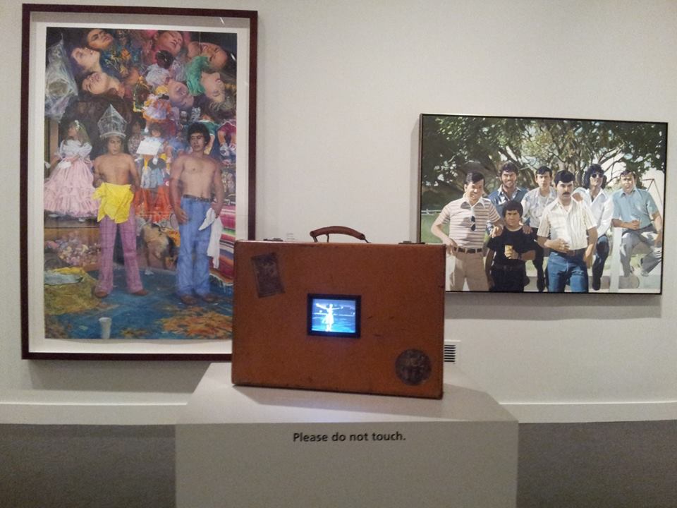
ADÁL West Side Story Upside Down, Backwards, Sideways and Out of Focus (La
Maleta de Futriaco Martínez) 2002
suitcase, flat-screen LCD monitor, single-channel digital video, color, sound;
Museum purchase through the Luisita L. and Franz H. Denghausen
Endowment© 2002, ADÁL
ADÁL’s footage on the small tv inserted in a suitcase in the foreground projected romantic singing scenes from 1961 West Side Story film, alternating with the realities of Puerto Rican life in 1960s NYC: “documentary footage of Puerto Ricans in New York, readings of Nuyorican poetry by Pedro Pietri, and the music of Tito Puente and Brenda Feliciano.”
The compelling photographs by Sophie Rivera taken in NYC are based on random people whom she asked to photograph. The original huge photographs were put up in subways, giving a reality and an immediacy to Puerto Rican people as individuals. They directly connect to the long standing traditions of portrait photography all the way back to Nadar, even as the subjects assert themselves.
Sophie Rivera, Untitled, 1978, printed 2006, gelatin silver print, Smithsonian American Art Museum, Museum purchase through the Luisita L. and Franz H. Denghausen Endowment. © 1978, Sophie Rivera
“We Interrupt This Message” featured radical groups like ASCO, who pioneered street performance art and public interventions that subverted and upended media and art world stereotypes about Latinos.
Asco (Harry Gamboa Jr., Gronk, Willie Herrón, Patssi Valdez), Photographer: Harry Gamboa Jr., Decoy Gang War Victim, 1974, printed 2010, chromogenic print, Smithsonian American Art Museum, Museum purchase through the Luisita L. and Franz H. Denghausen Endowment
© 1974, Harry Gamboa Jr.
“Signs of the Popular” included Carmen Lomas Garza’s genre scenes and other artists depicting aspects of everyday life. This is, of course, a standard theme in American Art History, the connection of popular art and the mainstream in genre scenes. Garza remembers her own childhood in Kingsville, Texas.
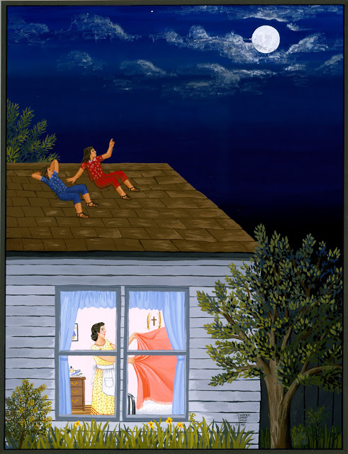
Carmen Lomas Garza Camas para Sueños 1985 Museum purchase through the Smithsonian Latino Initiatives Pool and the Smithsonian Institution Collections Acquisition Program© 1985, Carmen Lomas Garza
An entire wall was filled with political posters all of them by famous artists. The graphic arts movement within this period of time was revolutionary in every sense of the word. Grouping so many powerful and famous works together did tend to diminish their individual importance, however. This is really the heart of the Chicano political graphics movement.
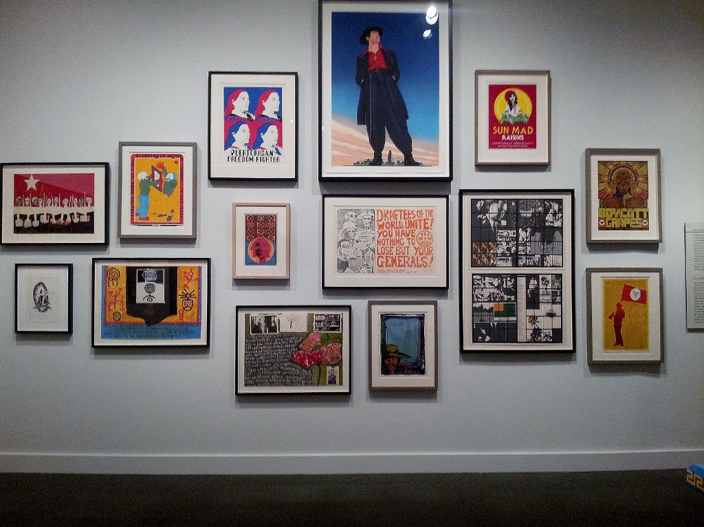
We can see at the top the stunning work of Ignacio Gomez, Zoot Suit, 2002 commemorating the central character in Luis Valdez’s eponymous and famous 1978 play, Zoot Suit. As Ramos explains in the catalog:” During the early 1940s, young and stylish Mexican Americans or pachucos wore zoot suits as a rebellious stance against their elders and against a racist environment that often dismissed them as criminal gang members.”
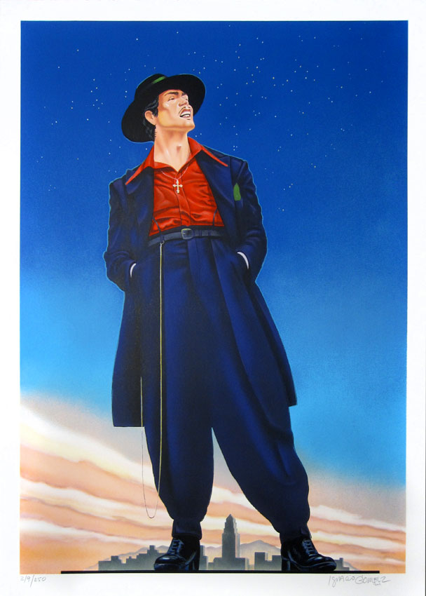
Just to the right is the famous work by Ester Hernandez Sun Mad Raisins ( The Virgin of Guadalupe Defending the Rights of the Chicanos) that needs no explanation. It could have been done yesterday.
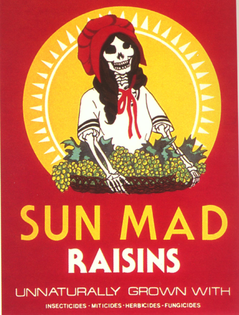
Malaquias Montoya,a crucial figure in printmaking and political action over the last fifty years is also included in this group of works. As Terezita Roma states “Montoya did not accept any division between the political and the artistic; instead his artwork forged a tight relationship in which each was intrinsic to the other.”(Malaquias Montoya, UCLA 2011 p. 8)
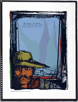
Another political section was Turning Point: Civil Rights Era, that included the famous altar by Amalia Mesa- Bains dedicated to Dolores del Rio. Amalia Mesa-Bains herself is another revolutionary, even today, speaking up about the need to be pro active and resistant to domination. She even organized Latino/a MacArthur Fellows!
Amalia Mesa-Bains Ofrenda for Dolores del Rio 1984, revised 1991 mixed media installation including plywood, mirrors, fabric, framed photographs, found objects, dried flowers and glitter Museum purchase through the Smithsonian Institution Collections Acquisition Program © 1991, Amalia Mesa-Bains
“Street Life”included the powerful work of Luis Cruz Azaceta, an artist I first encountered and wrote about in a review for New Art Examiner in 1987 He is now an old master, but still raw and compelling.
Luis Cruz Azaceta No Parking Here Any Time 1978acrylic on canvas Gift of Sharon Jacques © 1978, Luis Cruz Azaceta
But the real surprise of the exhibition came in the last room, a room full of elegant abstraction. Here was Curator Ramos’s most clear cut stand for mainstreaming Latino/a art. The artists in this gallery were working within the abstract traditions so beloved of art historians and art critics, particularly on the East Coast. Why are they never mentioned outside of Latino publications? Because they are immediately perceived, as in the review of “Our America” by the Washington Post, as imitating well known artists. The abstract artists are all tossed off as “derivative,” a tired cliché. All of these artists and this topic are worth a separate discussion.
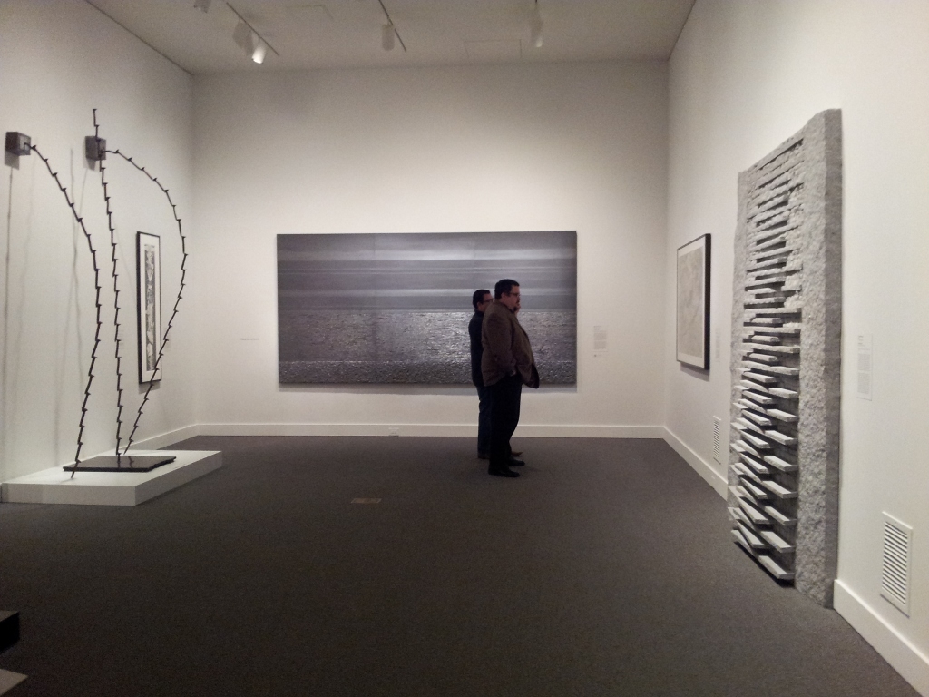
Freddy Rodriguez was, as he has said, inspired by early Stella, but it is obvious that he has found his own way to include jazz like rhythms and rich colors, an entirely different spiritual heat that clearly speaks of the Caribbean.
Freddy Rodriguez Danza de Carnaval(det)
1974
acrylic on canvas
Smithsonian American Art Museum, Museum purchase through the Luisita L. and Franz H. Denghausen Endowment, 2011.10.1
He responded to the review:
“When white artists engage the history of art, critics speak of influence and dialogue. When Latino or African American artists do so, it’s derivative. This is both an antiquated way of thinking and simply historically inaccurate. Asco’s No Movies predate Cindy Sherman’s film stills. Raphael Montañez-Ortiz’s recycled films remain the most avant garde works in the history of that approach to appropriated film. Carmen Herrera was in Paris at the same time when Ellsworth Kelly was there. They were both influenced by the City of Light’s abstract art scene. ”
Furthermore his work also has many aspects such as his intense series from 2000 titled “En Esta Casa Trujillo Es El Jefe/ In this House Trujillo is Chief!” which combines sumptuous surfaces, intense content and writing.
Freddy Rodriguez La Gran Finca, 1990
But the reality of this exhibition is that all of these artists do fit exactly into what is going on in mainstream US art history even as they distinctly make their own contribution.
Every category corresponds. I quickly perused a half dozen new histories of American Art to see if that was true (admittedly there may be a 21st century survey I have not yet seen). But the reality is that African Americans are still barely mentioned, and Latino/as are not mentioned anywhere in general histories.
The title of “Our America” is taken from an essay by the famous Cuban intellectual José Martí who spent a good deal of time thinking about the solutions to imperialism and the independence of Cuba. America, in his writing, is a term that refers to the entire hemisphere, not just to the US, a fact people in this country frequently forget it.
José Martí wanted a revolution for Cuba to come from people who understood the inner nature of Cuba, who were not conditioned by European perspectives. He believed in the US model of cultural blending. Using this title for the exhibition points to the thesis that the artists in the exhibition are both distinctly themselves as well as part of a larger culture to which they contribute.
I conclude with this ever stunning fiberglass Man on Fire by Luis Jimeniz, his homage to Orozco’s painting Man of Fire of Cuauhtémoc, the valiant Aztec ruler tortured by fire during the Spanish conquest
Jimenez combines contemporary aesthetics and material, meaning that resonates to everyone, and the artist’s sense of history and resistance.
This entry was posted on February 14, 2014 and is filed under Art and Politics Now, art criticism, Chicana Artists, Conceptual Art, Contemporary Art, Uncategorized.
ANTONI TÀPIES 1923 – 2012
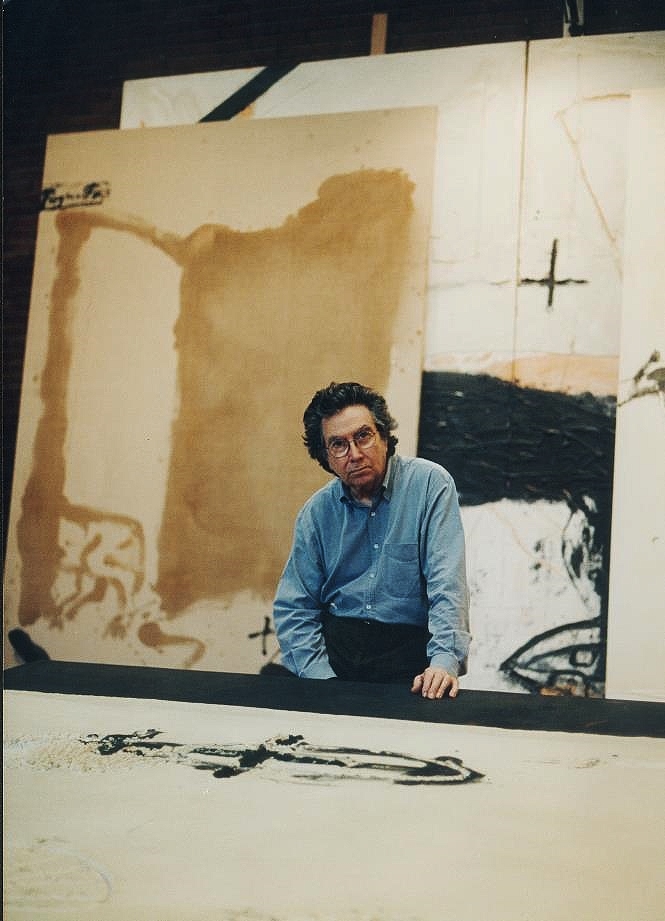
In honor of the New Year 2014 I give you Antoni Tàpies, one of the outstanding twentieth century artists who engaged both profound concerns about the state of the world, and corresponding boldness in exploring aesthetics and material as a way to connect to those concerns. In Part I, I analyze an exhibition in Venice.
In Part II, as a New Year’s present to my readers, I have included the section of my book Art and Politics Now in which I write about Tàpies. That makes this post a bit long.
PART I “Lo Sguardo dell’Artista,” Museo Fortuny, Venice Fall 2013
“Franco wanted to show Spain he was tolerant, so he allowed modern art- I had to walk a fine line to not allow myself to be used.”
Thus speaks Antoni Tàpies in “Lo Sguardo dell’ Artista (The eye of the artist) at the Museo Fortuny in Venice. More than an exhibition, “Lo Sguardo” is an act of love from his friends to honor him in the year after his death. It includes two films, many major art works by the artist, selections from his wide ranging personal art collection, never before exhibited, works by his friends, and even personal pieces of furniture.
Each floor of the large palazzo had a different mood. On the ground floor was a large simple space with big work, as well as a large sculpture by Anthony Caro, in an adjoining room.
The first landing had a rough wooden floor that changed the atmosphere from gallery to unpredictable exploration.
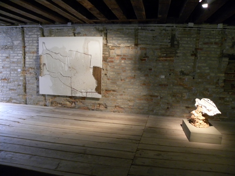
We were confronted with an intense African sculpture from his collection juxtaposed to a painting and a single sculpture. They spoke to each other across the room.
The next floor is the official Museo Fortuny that displays the fashion designs of Mariano Fortuny. He created stage designs and fashion in collaboration with his wife. Included in the collection are Chinese paintings and robes, stage sets, wooden dummies, and memorabilia. Inserted into this array, without labels, are such works as a painting by Picasso, Gudea in marble, Tàpies Book 1 Libre 1987. In a small case on successive shelves, arranged by the curators, include a coat hanger, copper pot, bronze cross, painting on concrete, screwdriver, spatula (for plaster), scrolls, shell, leather, cat/tiger emerging from granite, stone tied with leather. The mixture of dissimilar objects created a rough conversation, disrupting our equilibrium as viewers and opening off beat aesthetic connections.
A heartfelt statement by Antone Ueng is nearby:
“I urge viewers who struggle to understand Tàpies art not to look for explanations. If they look carefully and that is all if they are open and allow themselves to be possessed by what refuses to be classified, the the painting will find its way through, by stealth. And one day unexpectedly the core of our soul will be swept away like the walls of Jericho and a pleasure produced by the gaining of recognition will be obtained. “
In a dark side room a dazzling red painting by Gutai artist Kahuo Shigako jumps off the wall, the paint so thick that it looks like smeared blood . Tàpies hung the Shigako painting at the entrance of his home, telling visitors exactly what to expect from him.
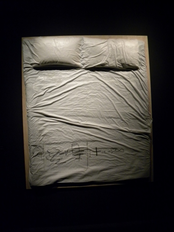
In another small room is Tàpies llit 2009, and a Chinese Buddha sculpture (Suei Dynasty, 6th century) that he had in his bedroom, an intimate Miro and Max Ernst’s Fort Bleu. The music playing is by Giacinto Scelsi – “Xnoybis” – performed by Vincent Royer on two strings. James Turrell’s glowing light installation, Red Shift has another room to itself. These are meditative experiences. The Bed makes an intriguing comparison to the famous Rauschenberg bed. Here we feel a restless sleep, a hidden anguish, a bed that invokes private moments for a man who felt the oppressions of the world so deeply.
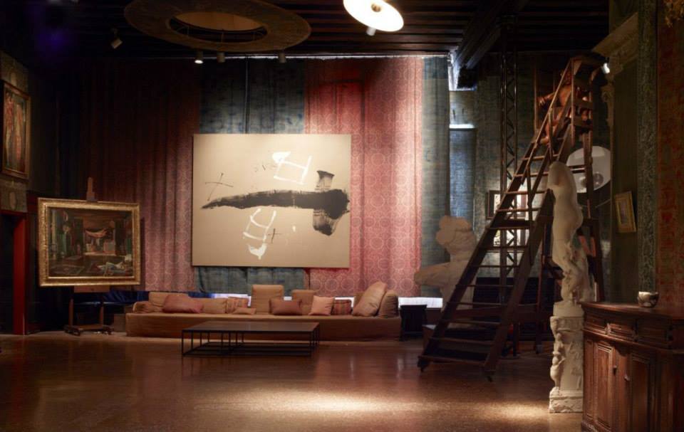
The main rooms of this floor create a textured intersection of Fortuny and Tàpies, fashion and desire, juxtaposed to the deep material metaphors of Tàpies that speak of oppression. But in this display the textures, intimacy, and cross references foreground spirituality, an important dimension of Tàpies personal collections and private life.
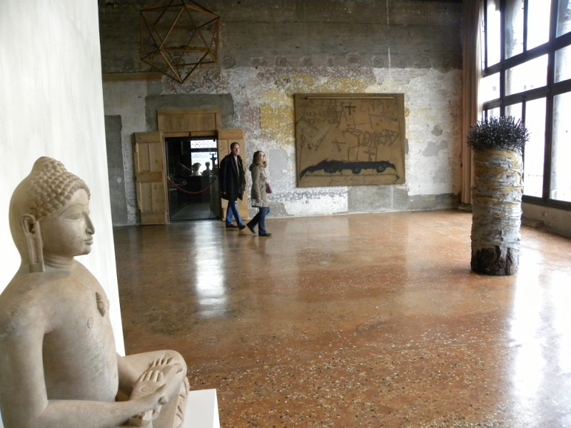
On the second floor a large open room with walls bearing plaster pentimenti creates an open, but slightly desolate, sensation, with the widely spaced Despertar Sobtat 2006 and Gran Tors 1996 near to Gunther Uecker Trees and Nails a Tribute to Tapies, 2008 – 2013 (center) and a Jain seated sculpture (foreground). A film on this floor speaks of Catalans identifying with Tàpies in their religious and political resistance to Franco.
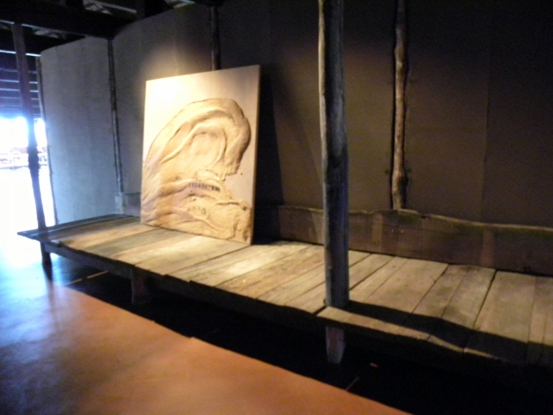
The entire top floor is devoted to an installation “Wabi Inspirations” conceived by architects Axel Vervoodt and Tasuro Mik, explained as follows
“ Towards the end of his life Tàpies developed a heightened interest in Eastern culture, a concern which increasingly became a fundamental philosophical influence on his work because of its emphasis on what is material, the identity between man and nature and a rejection of the dualism of our society. In this ‘labyrinth of silence’ labyrinth of sacred proportions inspired by Eastern and Western culture are several “tokonomas” four outside and four inside. Toko means platform “ ma” framed emptiness, made from humble materials as Venetian bricolet, cardboard, painted with earth from the lagoon. I tried to create a dialogue between the most silent and serene works by Tapies related to the great masters of calligraphy and anonymous objects made by nature.”
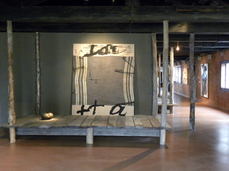
A small work by Kandinsky points to the interior labyrinth: as we walked through the semi dark we encountered a score by John Cage, then in the deepest interior there was a Toraja Funerary door Indonesia and Grans Vertical.
It was a temple.
As a way of coming back to reality, near the exit was access to Sudharu Horio’s 21 meter pole resting on a water mattres that rose from bottom to top of the building in an inner courtyard. I stood on the water mattress without my shoes and felt the instability of the base as well as the cold of the water.
PART II Excerpt from Art and Politics Now, Cultural Activism in a Time of Crisis (available from this website). I am talking about his work here from a political perspective. The “Sguardo” was dominantly aesthetic.
In Art and Politics Now, Tàpies is the first artist in Chapter 3 “Resisting Police States:” my discussion focuses on the connection of his work to political protest as well as to the continuum of political art:
“By way of acknowledging that all atrocities committed during warfare are one and the same, regardless of which war or which century, this chapter begins with the abstract work of the Catalan old master, Antoni Tàpies. His chilling metaphors of abuse and suffering first emerged in the years after Franco, allied with the Nazis and other forces of fascism, emerged victorious in the Spanish Civil War, and brutally ruled Spain.
“Antoni Tàpies provides a direct connection between the mid-twentieth century and the present. In spite of Tàpies’s position as an established “old master” of twentieth-century art, he disrupts the so-called “heroic” critical interpretation of abstract expressionism with disturbing references to pain and oppression. In a Tàpies’ exhibition, no matter how august the setting, the blunt physicality of the materials and the rough gouged surfaces are a call to arms—a spirit working in opposition to the status quo. A huge pounding of physical form deeply penetrates our consciousness. A ceramic foot, head, torso, arm, or body fragment emerges from chunks of earth, confronting us with its tortured history.
Tàpies’s Catalonian roots help explain his ferocious resistance to oppression. As a teenager during the 1930s, Tàpies worked for the democratic government of Catalonia to which his father was a legal advisor. The Spanish Civil War which broke out in 1936 abruptly ended Catalonian independence. The fall of the Socialist central government of Spain, to Franco in 1939, and the crushing of the autonomy of Catalonia deeply affected him. Franco killed hundreds of thousands of resistance fighters in the early 1940s; he sent many others into internment camps or forced labor. The police repressed Communists and trade unionists; Catholicism was the only sanctioned religion. Castilian Spanish was the only legal language. The government censored writers, artists, and other intellectuals and threatened them with imprisonment. While the atmosphere has radically changed in Spain since those years, Tàpies continues to address political oppression and human rights abuses, such as torture, in his art. His original experience is now transposed into a statement about our contemporary world.
In addition to political oppression, Tàpies, like many artists in the 1940s, was deeply affected by the exploding of the Atomic Bomb in Nagasaki and Hiroshima—leading to the final stage of massive death and destruction at the end of World War II. As one writer has suggested: “Tàpies shared a general sensibility which affected artists on both sides of the Atlantic . . . an interest in matter—earth, dust, atoms, and particles—which took the shape of the use of materials foreign to academic artistic expression and experiments with new techniques. . . .”
Llit Marro/Brown Bed (1960), resembles a flayed skin or bandages; a bulge and hollow near the bottom is dug out, as though someone is lost in this darkness, trying to escape with barely a foothold or handhold. In Gris, taronja, rosa/Grey, Orange, Pink (1967), Tàpies marks blunt lines into a thick scarred drab grey surface; the canvas appears to be under attack, and the orange is a swipe more than a stroke, as though created desperately. Sand bulges off the caked surface in awkward shapes; nothing is comfortable. In Forma negra sobre quadrat gris/Black Form on Grey Square (1960), a head seems trapped in the greyness or buried under it. Matèria Rosada,/Rose Matter (1991), suggests the decay of a body.
His assemblages provoke us as metaphors as well as facts. In Pantalons sobre bastido/Trousers on stretcher (1971) a pair of rough workman’s pants caked with grey paint hangs upside down on a canvas stretcher; the stretcher becomes a type of scaffolding. The upside-down pants recall Goya’s etching of a man being castrated upside down in the Disasters of War, and the crotch of the pants is indeed cut open here as though castration has already happened.
Tàpies’s ceramic work is equally forceful. He savagely pierced the larger-than-human scale sculpture of a foot, Pie/Foot (1991), with metal tools, creating an image of torture that corresponds all too immediately with the willful violations of the human body in prison camps of so-called “enemy combatants.” The truncated foot can also be read as a reference to a talisman, or even to a Christian relic—from an unknown and ordinary worker. His work emphasizes humble forms, objects, body parts, and materials. In the ceramics he makes or re-uses a bathtub, a door, a bed, a wall, a head, a skull, a torso, an arm, a coffin, a sock. A cross (which can also be read as a plus sign or the “t” of the artist’s name), numbers, or floating symbols are embedded, cut out, incised, or even hacked into these rough surfaces.
Tàpies once said, “What we call reality is not reality. When for example, I draw a head, I quickly feel the need to destroy, rub it out, because I have only managed to grasp its external appearance, when what really concerns me is what is hidden behind that visible form.”
At the same time, he is transforming basic matter into something more charged, more energized. As one author explains, “In Tàpies’s work magic and mimesis have a common origin which refers directly to its ‘Catalan spirit’: the tradition of medieval alchemy and mysticism.” But what appears as energy in his art is not an heroic gesture. It is rather, a heavy stroke, a trudging movement, a difficult act, an act that is rubbed out and destroyed and re-enacted. Likewise, alchemy is not a private conversation, a form of masturbation or secret domination through magic. This alchemy of humble materials—like a corrugated tin shop door, workman’s pants, straw, or dirt, is about ordinary human suffering, survival and transformation. Tàpies’s walls (always more than a literal or metaphorical surface) are walls of suppression that can be survived, can be marked, but cannot be avoided. He seeks “matter in a state of constant movement and change, a state that stands in opposition to the fragmentation and compartmentalization of the contemporary western world. . . . What is important is not these forms, but rather the existence of a being or object undergoing formation or deformation.” Tàpies transforms raw matter into a metaphor for destruction and survival; he connects, in his use of humble materials, not to the Abstract Expressionists, but to the Italian movement of Arte Povera as well as to the Beat artists of San Francisco, such as Jay De Feo and Wally Hedrick. His work reminds us of past atrocities, even as it speaks directly to our contemporary crisis of crimes against humanity.
This entry was posted on January 3, 2014 and is filed under Art and Activism, Art and Politics Now, art criticism, Art in War, Contemporary Art, Uncategorized.
East of the Caspian Sea Central Asia in Venice
Have you heard of Abay Qunanbayuli? He is a nineteenth century poet from Kazakhstan who wrote at the cusp of the modern era, and is regarded as the intellectual foundation for the country.  Winter is one of his most famous poems as well as the theme of the Central Asian Pavilion at the Venice Biennale. His poem is full of frozen, cold references about the difficulty of survival in the midst of bitter cold. That metaphor is central to the pavilion. Tiago Bom (Portugal) and Ayatgali Tuleubek (Kazakhstan), two young curators based in Oslo, Norway, explore the theme of “stagnation.”
Winter
Broad-shouldered, white-coated, powdered with snow,
Blind and dumb, with a great big silvery beard,
Granddad Winter plods on with a frown on his brow,
By everything living hated and feared.
The grumpy old fellow does plenty of harm.
His breath stirs up blizzards, brings snow and cold.
With a cloud for a hat on his shaggy head,
He marches along, all the world in his hold.
His beetling eyebrows are knit in a frown.
When he tosses his head—dismal snow starts to fall.
Like a crazy old camel he acts in his rage,
Rocking and shaking our yurt’s thin wall.
If the children run out to play in the yard
He pinches their noses and checks with cruel hands.
No sheepskin can keep out the freezing cold;
With his back lo the wind, the shepherd stands.
The horses in vain try to shatter the ice—
The hungry herd scarcely shuffle their feet.
Greedy wolves—winter’s henchmen—bare their fangs;
Watch, or disaster your flocks may meet!
Drive them off to safe pastures—don’t wait until day.
You won’t die if you sleep less—come, quicken your step.
Kondibai and Kondai aren’t as wicked as wolves—
Don’t let old man Winter feast in our steppes.
Abay Qunanbayuli, 1888
Translated by Dorian Rottenberg
For those of you who are weak on the geography in this part of the world, Central Asia is East of the Caspian Sea, and includes several former Soviet countries: Kazakhstan ( the largest), Uzbekistan, Tajikstan and Kyrgyzstan. (also Turkmenistan not included in the exhibition).
I have to add here a phenomenal article just published in Z magazine and available online from Allen Ruff’s blogspot that gives us the US history with these nations since their “independence” from Russia. We have been pouring untold amounts of money into these countries, all of them with horrific human rights histories.. The enormous economic bonanza of the “war on terror” in Afghanistan going to leaders in the”stans” who are siphoning billions off for their personal benefit, as they practice all the abuses we are supposedly resisting and fighting against, certainly must form the “frozen winter” of this discussion of a courageous effort on the part of creative young people from Central Asia who are exploring ways of moving beyond repression. Their power is small, compared to these large economic forces, but they represent a pinpoint of hope and light. Unfreezing minds that live in fear is the first step to freedom.
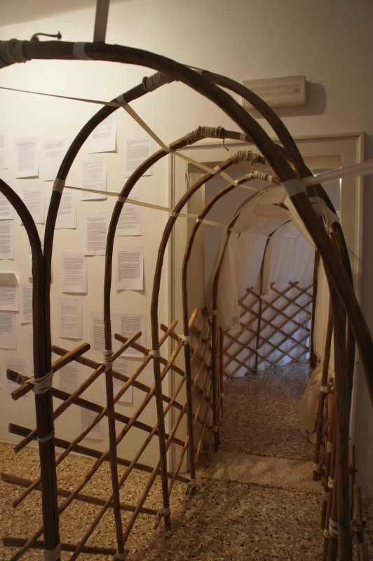 .
.
The intellectual theme of the pavilion is not apparent in a walk through where we first saw an altered yurt (traditional nomadic home) Zhol (The Way, 2013) by Kamilla Kurmanbekova and Erlan Tuyakov, a wooden structure that was a comment on the government’s appropriation of it for the idea of nationalism. Rather than the sturdy structures of traditional yurts, there was an unstable quality in this slender construction, certainly a metaphor for the state of nomads as well as the perceptions of outsiders.
There were large white letters by Vyacheslav Akhunov that looked like minimalist sculptures but turned out to be Cyrillic characters referring to a public monument that was censored in the 1970s;
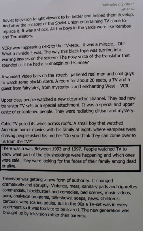
Letters from Tajikistan (2013) Anton Rodin and Sergey Chutkov presenting “patterns of dissent and affinity;” In this letter the changing and insidious role of television since independence is described.
Ikuru Kuwajima’s color photographs of a desolate urban environment which were taken in Northern Kazakhstan where the government has built a new capitol in a frigid environment,
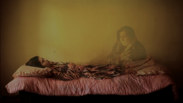
Zukhra by Saodat Ismailova which draws on mythology and childhood
memories
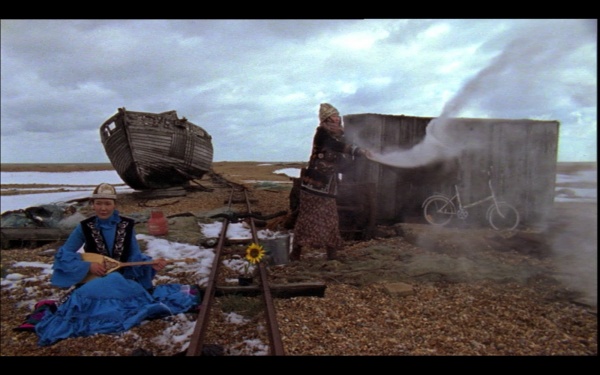
Aza Shade’s The Disappearing City. Shade explores, with an edge of the absurd, the distance of young people from traditional culture: the mother of a young woman insists that she pose with traditional clothes playing a traditional instrument for tourists, but then the daughter changes into contemporary clothes and walks off.
But the pavilion was a layered event, with forums, films, and an online catalog coming in June. Its intellectual depth emerged only slowly, a bit like the process of unfreezing. Once I read the poem several times, as well as the other materials, it was clear that the organizers were deeply committed to thinking about the position of culture within a hostile (frozen) environment, the situation both literally and metaphorically in Kazakhstan in particular.
That country has had the same Soviet era Communist leader since independence. There were photographs online of intense conversations held in the pavilion courtyard during the opening and in the first week of October. To better grasp the extent of the pavilion, which reaches to Oslo, as well as to Almaty, Kazakhstan, go on line and view lectures such as that by the extraordinary Kazakh filmmaker, Almagul Menlibayeva.
I had the good fortune of seeing two of her films at the Asian Art Museum in Seattle last year, thanks to our wonderful curator Pamela McClusky. Menlibayeva grew up in the last years of the Soviet Union and was educated as it crumbled. Before capitalism invaded the country, she spent five years in a young artists collective. She dramatically conveys a desolate and surreal atmosphere of mythic history, empty modernism, and nomadic transformations in her films which convey “her own nomadic heritage with spiritual residues of traditional belief systems” as McClusky puts it.
The Central Asian Pavilion was much more than the sum of its parts. I am looking forward to the publication of its catalog in the spring which will give us more texts. The organizers of “Winter” sought to invite conversations about culture in Central Aisa,to stimulate new directions within the parameters of the difficult political and environmental conditions of the countries of Central Asia.
This entry was posted on December 12, 2013 and is filed under Art and Politics Now, art criticism, Contemporary Art, Uncategorized, Women Artists.